From the moment we saw the first trailer for The Gilded Age,”Julian Fellowes’ follow-up (and in some ways, companion piece) to Downton Abbey, we knew we were going to swoon over the costume designs. As soon as we screened the first few episodes, we knew we wanted to talk to the series’ costume designer Kasia Walicka-Maimone. She has a decades-long career working with some of the biggest names in film and television on some of the most memorable shows and films of this century, from Moonrise Kingdom to Ready Player One to Capote. She has a long and varied history doing period work, but we were especially interested in her approach to designing for this series, which is bold and colorful and full of an energy and modernity you might not associate with the late Victorian era. She Zoomed in with us from her design studio and we just adored listening to her talk like an artist about her work. This interview has been lightly edited, mostly to remove all of our gushing from the conversation.
Kasia, thank you for taking the time to talk to us today.
Hi, how are you? We’re in the office and starting the second season. I’m in a big studio, so we all must (indicates her mask)…this is…I can show you quickly a glimpse of what we’re doing now. (She turns the camera around to show a studio full of sketches and samples)
Wow!
We read your articles. You guys are so amazing and so detail-oriented, you studied so well. We are very impressed.
Oh, thank you. We’re kind of obsessed with costume design over here. What was it like working with Julian Fellowes? Did you feel any pressure to sort of follow the Downton Abbey aesthetic or anything like that?
Julian is actually an incredibly interesting artist. He’s got a very clear idea of what the material is, incredibly detailed understanding of the history, of the period and the historical context of the world and the characters in that world. And at the same time he gives you enough space for creating the process, which is extremely, it’s just a great process because we give each other enough space and just do checkups with each other from time to time. And that was a very good process. And Downton Abbey was probably never mentioned once during the whole process.
We’re dealing with a very different world. We went ferociously about the research of the world and I always feel like it’s all about the process of discovering that world, so there was no comparisons.
Doing a period piece, obviously, you’re on some level beholden to what people wore at the time, but how much leeway did you have to be a little creative and add a little bit of yourself and your design aesthetic to it?
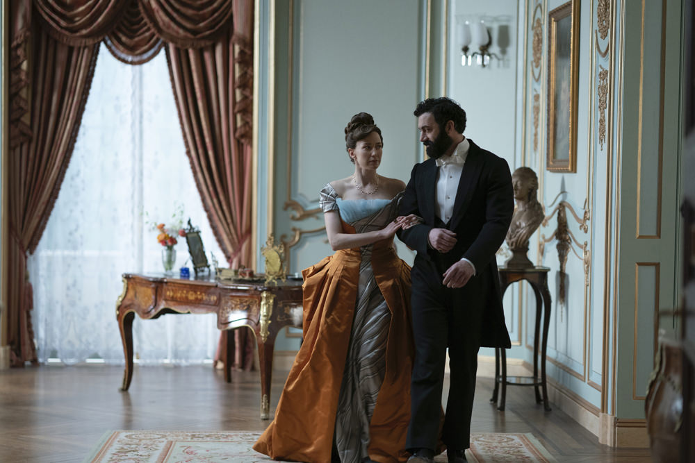
You know, it’s a big question, right? Because each one of us see things differently. My job as a costume designer on a project like this, it’s to discover the underlying language of the design. So my job is to read the scripts, understand the material fully, research the history, discuss it with the creatives, which is Julian, which is the director Michael Engler. Michael set the tone of all the visuals and then Salli Richardson later joined us and the directors of photography with [Production Designer] Bob Shaw, and then I take it back to my phenomenal design team and start the process. We started from incredibly detailed historical research and built a library of historical research, which includes photographs. We are lucky that period is extremely well documented. So you cannot have a shortage. And that period is an endless wealth of information. There’s also a lot of fashion plates at that time. So there is a wealth of information to draw from. And then it’s my job as a designer to put an eye to it and create characters for a movie. I would say 95% of the elements that we use resonate from the pieces that we found in historical research. They might not be applied identically or how they were applied at that time, because we also are creating characters.
So I have to find vocabulary for each of the characters that is different from each other. You cannot take a historical piece and assign it to each person; things shift, you know. So we have to also be storytellers. When you’re doing the storytelling, things get shifted from that ideal representation of history, because that’s the difference between creating a reflection of, you know, reenactment or documentary versus creating a material that is deeply steeped in history. And we all consider ourselves to be very respectful to history. At the same time, we are recreating a different world.
How much does the casting figure into the costume design? Did you make any decisions based on the actor and, say their own coloring or anything like that?
It’s like, it’s like this giant puzzle that we all create. There is also, I’m responding to the worlds that are being created around me; to the sets, to the environments, to the way characters travel through those spaces. And then when the actors step in, we’re always endlessly curious who is going to be playing that part. Sometimes when I step into it, we already know who is going to be playing the main part. Sometimes those characters are up to us. And there’s always this moment of adjustment that this whole design is going to be specifically done for the actor who is going to embody it. And they are an enormous voice in what it needs to be, the way they carry the costumes. I love that part, that it’s not a solitary journey. It’s a collaborative piece. So many elements that, in a way, they require this enormous amount of diplomacy. Maybe it’s not diplomacy; it just becomes ingrained after a while. You just put it together, you just become like a puzzle maker. Just like if you do a lot of puzzles, you just become better at it.
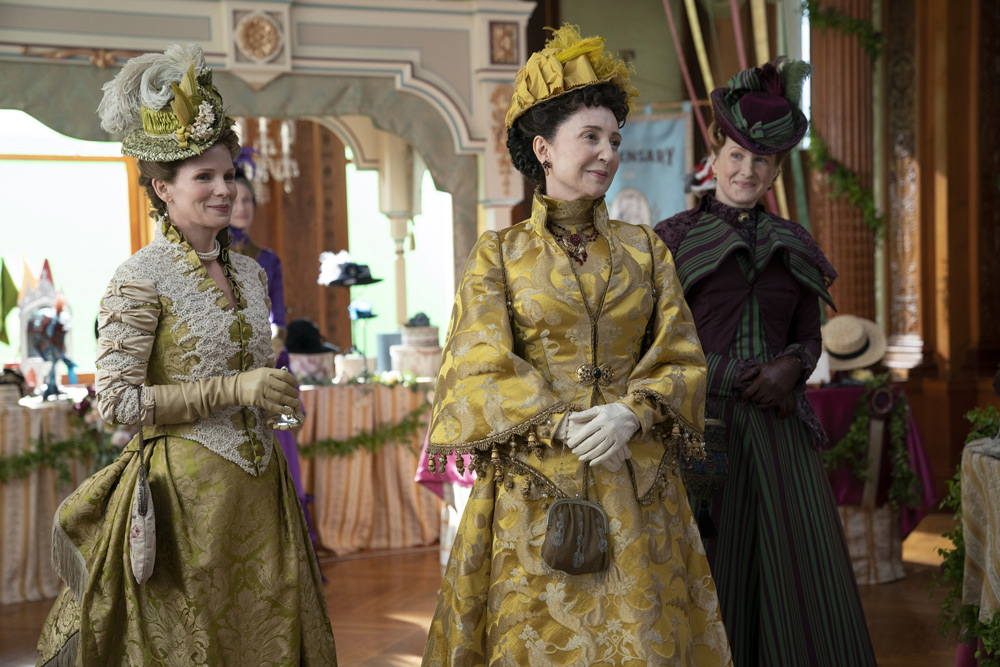
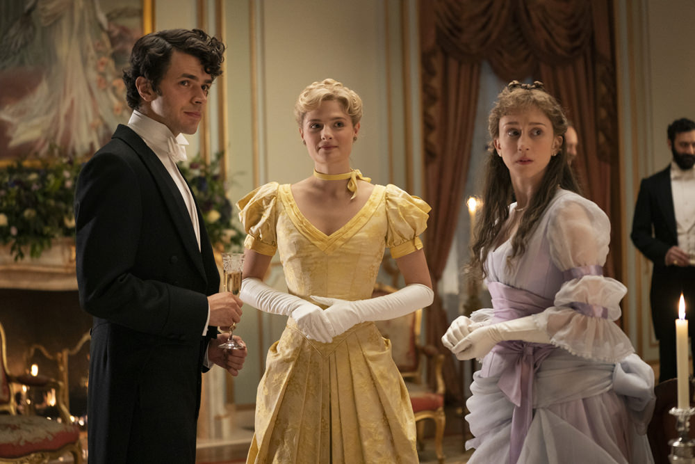
I wanted to talk about color because I think the average viewer might not know that Victorian clothing was actually incredibly colorful, especially in the upper classes. The widows and orphans charity in the second episode, it’s like a candy store. The outfits in that scene are so eye-popping. Can you talk a little bit about how you settled on palettes and that sort of thing? Did you feel like you could go wild?
You know, there’s never going wild in this process, it’s so calculated, it’s so thought through. But the discovery that we had from that period was this shock of color, and discovering the amount of color, because this is the time when the artificial dyes stepped in. My understanding was that this was the time when we discovered the color, like the dress that Bertha is wearing for the bazaar.
With the peacock feathers? Gorgeous!
For the bazaar — and also the one for the meeting; both of those colors, they are quotes from other. Through other garments, we discovered those colors did exist in the period. And that’s what was so shocking to discover that color that they did, that fluorescent yellow did exist.
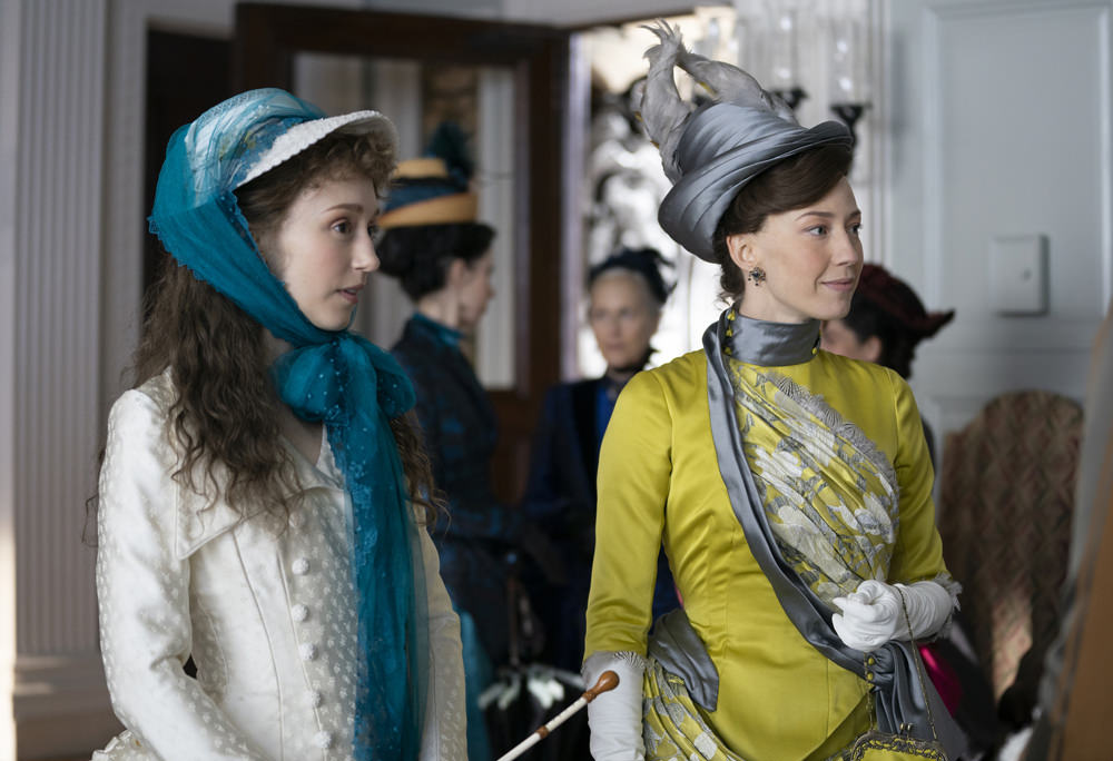
And it wasn’t yellow. It was like yellow mixed with green. We were obsessing about finding the reproduction of this color because also we are looking at pictures of garments. We were designing this whole piece during Covid. We couldn’t go to libraries and touch the costumes. Everything was shut down. So a lot of the interpretations of the colors are from books from, you know, the Metropolitan Museum and from all the sources that were available to us digitally, so some of the color might be a hair off.
When you see these scenes of all of these society women gathered in their finery, it’s really interesting how they managed to find variations in style within the restrictions of the time. Can you talk a little bit about how women of the Gilded Age interpreted fashion?
Women spent a lot of time on their clothes and there was an incredible and varied amount of dressmakers. There was a lot of European styles mixed in, there was a lot of money to be spent on the clothing. And women did change several times a day. What we discovered from pictures is that there were personal styles. You very rarely find two things that look alike. There were fringes and roses and bows, beads and feathers, you name it. I mean, there was an endless amount of inspiration and what I always pride myself in, and the design team that I work with, is that we find the variety of humanity, because we all are so different. And to be in this luxurious place for this job was that we actually have time and opportunity to recreate a lot of differences for people that we don’t have to rely on depleted rental houses. We were creating new palettes for the backgrounds and they were very calculated, and they all came from historical research. So this was not an invention of a fantasy. it was very much driven by historical research.
How much vintage did you use as opposed to garment made in the production house?
Well, we didn’t make it all in house, we made it in several houses — in Europe, in New York. There were so many fantastic makers who helped us execute them. There were hundreds of hands executing those costumes. We didn’t use that much vintage. We pretty much recreated everything.
When it comes contemporary costume designs, usually they’ll create several pieces of the same costume in case one gets damaged during shooting. How does that work with period pieces? They’re so complicated and so intricate.
Honestly only for very specific stuff when we needed doubles. When somebody gets, I think that scene with Peggy at the train station, we might have made a double, but I’m not even sure. We avoided doubles. Those garments are incredibly time consuming. It takes forever to execute them. And there was no need. It’s not an action film. There was no need for them to be doubled. I think that there was a few doubles only for maybe horseback riders or something like that.
We heard you made over 5,000 costumes, is that correct?
I think close to 5,000 costumes, but maybe between four and five thousand costumes.
Wow! I think most people don’t realize when they watch a show, that a costume designer creates costumes for everybody in the scene, which is a massive job.
It was a massive job because those costumes, that period does not exist in rental houses,or it’s very spare in rental houses. So we did need to create for the duration of our piece and for the look that we needed. We had to build a lot of extra pieces. We used some of the menswear. We used some rentals that were chosen from probably every rental house available in the world to us. I mean, Europe and the United States. And there’s not that much. I mean, it’s a very controlled, it’s a very, probably after this, because I think that there’s more stuff shooting that period right now. There’ll be more stock.
Can you talk a bit about designing for the less showy characters like the men and the servants?
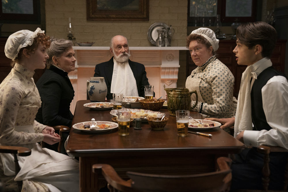
In the design process, we strategize very specifically all of those worlds. I work with an extremely experienced group of people, our design team is a machine of extremely well experienced people, we are all creating those worlds. This is not ;a solitary journey. It’s not my solitary journey. I do probably bring this eye of what and how things are supposed to look like, but it’s created by several people. It wouldn’t exist without them. We designed the extras, we created the palette, pulled out the fashion plates, found the fabrics, sent it off to the makers. That’s the process that starts a long time before we start the principals. Then we designed the world of the servants. For Bertha’s household, very few houses created uniforms for the servants, but there were a few who did, and we ran with that idea for Bertha’s house. The rest of the houses, like the Brooks house would, a lot of the servants were given fabrics for Christmas presents and then they would make their own garments. So they were even given more or less similar fabrics because they came from the same person and they would create their own dresses. That’s the idea we used for the servants in the Brooks house. The palette which is somewhat similar, but there were varieties and differences in that world. And they’re much more old fashioned or classic shapes.
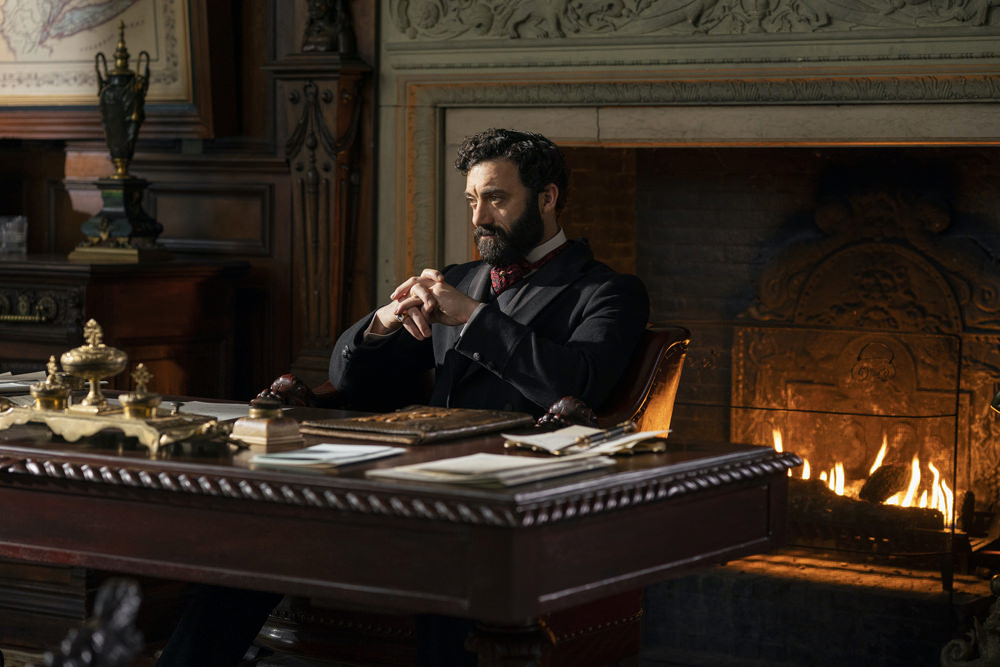
For the men, that’s a whole world of strategizing, they might look similar because of that period, the menswear is a smaller palette. It’s the browns, primary blacks for the workingmen and a lot of greys and then variety of waists and ascots and pins and cufflinks, but it’s not the color display happening with the ladies.
How did you define old money style and how do you define new money style within this world?
Well, you know, this is the trick; what we’re all learning with this material. Bertha is supposed to be just the better version of that society, she wants to belong to this society. She doesn’t want to be somebody who’ s a revolutionary, she’s not a provocateur. She is somebody who is just bringing this new forefront of fashions. The thought was always that she brings the forefront of Parisian fashions, that she brings the forefront of European fashions, that the new money embraced it much more easily. Those gowns were extraordinarily expensive from the Worth House, the main house, also Maison Félix, but primarily the Worth House, they cost an extraordinary amount of money. The ladies from the old guard were also buying those gowns, but they were keeping them in their closets for about two, three years until the newness of the style calmed down a bit.
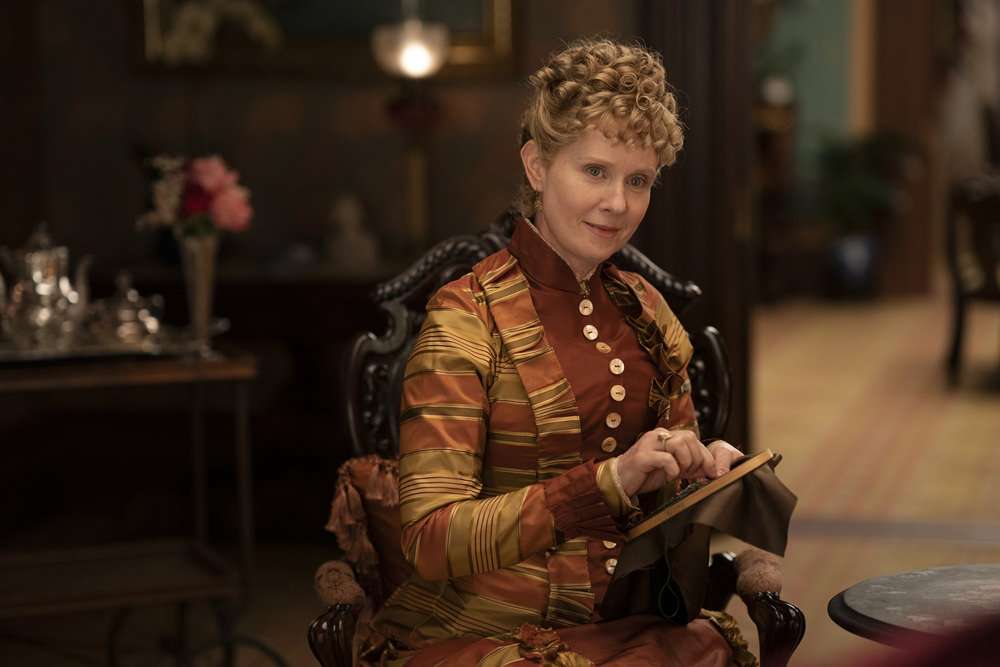
That’s what we found in some of the research parts, because you know, it’s also like as you scroll through those fashions from that period, when you go to 1875, then you move to 1882, when you move quickly to 1889, fashion moves fast. The shape moves fast. The silhouette changes. I mean the basic small waist exists, but the bustle also changes. That’s what we try to represent on Agnes, because we think she probably wears clothes from the beloved height of her fashion sense, probably 15 years older than contemporary. And at the same time, the bustle was moving to a very natural bustle. That’s why on Bertha, Marion and Gladys we’re using much smaller bustles. Those ladies existed exactly at the same period and if we did everybody exactly the same, I thought it would be wrong because I would be not acknowledging reality. People wore things that were older and newer at that period. And that’s what I tried to do with this, show that Agnes wears things that are older and Bertha probably the wear newest of fashions.
Can we talk about Marion a little bit? Because she’s got the old money background, but she’s got modern ideas and she’s relying on her aunts to pay for things. It feels like her style is distinct in the story; lots of white lace and blue florals.
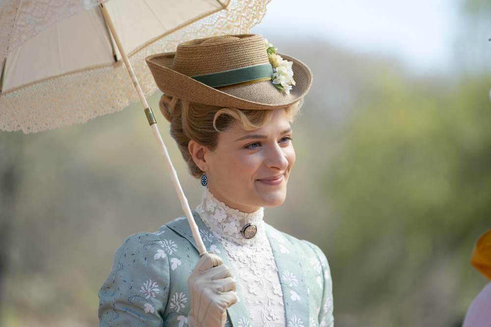
We’re trying to design each character, we try to find vocabulary for each character. And there are roots where they come from. She comes from a small town in Pennsylvania, grew up without a mother. She’s a country girl and yet with a very clear idea of who she is and what she likes. And I think [she has] that sort of utilitarian simplicity, at the same time the love for nature, in a sense, the beauty, bridging those two worlds of old money love of the classics and seeing what’s happening across the road. Her fashion sense awakens, and she is given the money to redo completely her fashions. We speculate to what degree her aunt controls it nd to what degree she has her own mind. Stylizing this by choosing the most flowery, delicate pieces because I love that that juxtaposition between her strong mind, her strong ideas and her… I mean, she’s looking for identity. She’s trying to find her place between the two worlds. Later in the season, I experimented with her fashions, and for this second season, I was like, “Maybe we need to pull her back,” because I also feel like young people experiment, but sometimes it’s better, sometimes it’s worse. In a way, we went on the same journey as she would. I don’t have all the answers for her. If it was perfect or not. I always feel like with every material and this is the luck of doing something for so long, you experiment with some stuff and try to find the language. We’re trying to understand this period. This period surprises us all the time.
There was so much, it was a very explosive period. There was a lot of wealth of information. There was just a lot of variety. There was a lot of inventions at that time. There was electricity, there was zippers invented. We went on this crazy search for what had been invented. So I think when there’s times like this of invention, I think that reflects on all the areas of life. So I think that’s that energy of newness, invention; that’s what we try to portray, this excitement of that period. And that brings us back to this general idea of design. Like, how do you approach the design?
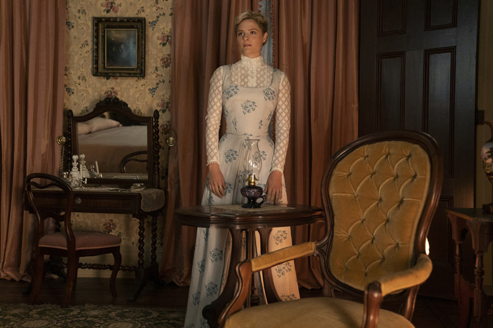
What I always say is when you think about periods, you try to think, “How would I feel being in that period?” I would be so excited seeing what’s happening on the street. And then when we, with a modern eye, look at that period, how do you evoke that feeling at the same time, trying to be truthful to the period? I don’t try to revolutionize it. I don’t try to disturb the rules of the period, but I was trying to find the excitement of the period. That search for what looks exciting to the modern eye of that period. And you know, that first dress for Bertha, that simplicity of that blade-like corset, I found it on a fashion plate. I didn’t invent that stuff, but it looks crazy modern, right? And I’m being questioned on it left and right! And I was like, “This came from a fashion plate! This came from the period!” But I think we are manipulators, we do pull the things that I feel are the most appropriate for characters. So we create this world and I don’t know, you guys study a lot of historical stuff. How do you feel about it?
Oh, we don’t think there’s anything on the show that that doesn’t look correct from our limited understanding of that period. That sense of excitement is exactly right. What can you tell us about Gladys Russell? We joked that she’s dressed like a 17th Century shepherdess by her mother.
My thought was that Bertha also relied very much on the advice of the fashion houses, that this is not a language that she know always very clearly from years of generations. Of this wealth. There is a guidance that comes probably like in the storytelling from Turner [her ladies maid, played by Kelley Curran] who knows more, who’s been around in this vocabulary. And she also relies on what the fashion houses have to offer. I always feel the old guard is effortlessly there and the new guard is trying to impress. That’s why the shape sometimes is more evoking of that excitement. Going back to this, what that period had to offer, there was just so much modernity at that period. There was so much asymmetry, there was so much of this free draping that I think John Galliano probably fed off from it for years and years and years. I think that Christian Dior took so many ideas from this period. There’s just an endless wealth of information there. And when I saw this asymmetry and this very free organic draping, I thought that gave us just this endless inspiration for creating so many beautiful garments that we needed to explore.
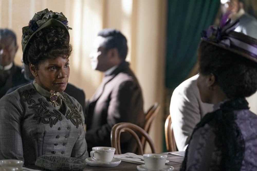
Can you talk to us about Peggy and her background as a member of the Black Elite of New York? How did you approach her and her family?
Luckily, everything was photographed very well, so we have an endless amount of great photographic research of that period. A lot of her garments came from that research. As with each environment that we were portraying…the Brooks household had a different sensibility than the Russells’ household; the same thing with Peggy ‘s family, they have a different sensibility. I just was paying attention to those different sensibilities of historical research that we were exploring and trying to create different textures and colors and ornamentation that is very specific to each of the worlds that we are presenting. And that applies equally to the Black Elite world that we are portraying…all came from historical research.
Was it difficult to find shoes and jewelry and accessories in general?
Yes, it was. But we had a lot of shoes made. Patrick Wiley, who worked with me on the design team, he’s extraordinarily experienced in period shows. He helped to create this whole operation, not only does he have an exquisite eye with menswear, womenswear, but he also knows how to strategize this enormous production of where to manufacture, where to rent from, where to make all the hats, where to create all the boots. And he prepared this whole plan for this giant operation. And then we had Isabelle Simone who joined us with the design team. And she’s a specialist of executing builds in New York and works with all the costume houses that make clothes. Susana Gilboe, who is a researcher and built an enormous library. Our in-house head of tailoring, Susan Bakula, who led our inhouse team that create a lot of the servants’ costumes and was in charge of the fitting of all the garments that were coming on, all of our principles and extras. Denise Andres, our wardrobe supervisor who was in charge of creating physically the whole operation. We had to fit all those extras and dress all those extras and put them on camera. It’s almost like a military operation that happens here. It’s a well-oiled machine and everybody has a function, including all the PAs who make sure that the packages are arriving in time from Europe, that they get open in time, that they get delivered on time. It’s an army of very attentive people. Agers, dyers, people who distress the pieces, milliners, the help of costume shops and workrooms in New York such as Eric Winterling, Tricorne, Donna Langman, and Barak Stribling. We had phenomenal makers working with us.
What is it like to create all these incredible things that sometimes don’t even show up on screen, or you can barely see them on a screen. Have you made peace with that as a costume designer?
I’ve worked on plenty of jobs; on one particularly when we were in this giant period piece. “We don’t see it,” the director told me, “but we feel it.” I think it’s funny sometimes but that’s what happens. I feel in this case, with The Gilded Age we see things. The directors of cinematography Vanja Cernjul and Manuel Billeter set the tone of how we are going to see this. They shoot wide and it’s not easy to shoot wide and portray those worlds. We really see things, left and right. The world is extremely well portrayed from all the angles. It’s kind of a dream come true. We see the principals; we see them from the top, from the side, from different angles. It’s like this dance or opera that I feel like it’s portrayed in front of us. There are very few static moments. When you design background to create that impression of the world, you don’t obsess about the amount of detail that goes into that kind of closeup that is happening for the principals. So with the extras, you design for color palette, for the style, for the general impression, versus the details, like a painting. What’s essential, crucial of what’s creating the world. So we pay very close attention to how those people look, because if they look bad, it would not work.
With a piece like this it is crucially important to represent the working class, to represent the servants, to represent the variety of humanity that existed. And even though we tell the story of the rich, it’s crucially important to present the world of the working class with equal due respect, as we represent all the other principals in the very wealthy world. I think that we really tried to just present the world as it was, and then tell the story as requested by the creators.
[Photo Credit: Alison Cohen Rosa/HBO]
Vivienne Westwood Spring 2022 Bridal Couture Collection Next Post:
Patrick Wilson and Halle Berry at the “Moonfall” Premiere
Please review our Community Guidelines before posting a comment. Thank you!

