Is it us or did it feel like they’d suddenly cut three or four designers between episodes? It’s always kind of a shock when you get down to five or so designers. The work room and backstage seating areas look so huge and empty all of a sudden. The energy level of the show tends to go down at this point because folks are exhausted and there aren’t as many personalities to bump up against anymore. Plus, the remaining designers are usually so end-focused that they don’t tend to make very good television.
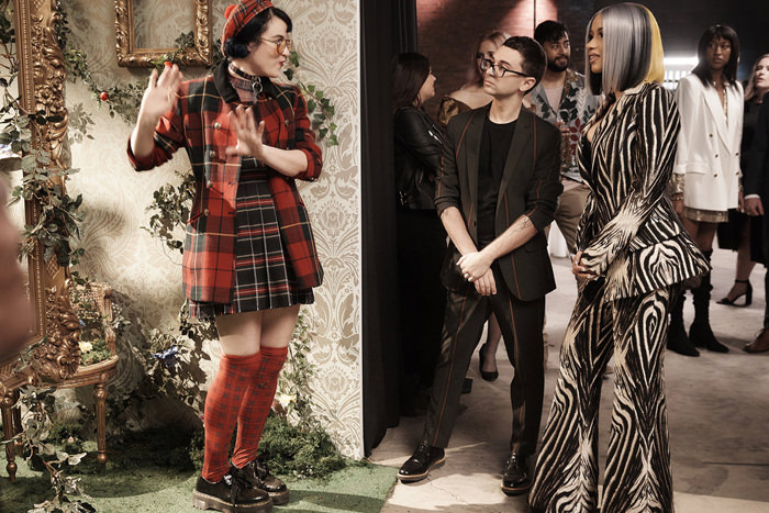
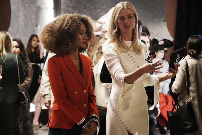
Which makes the devising and directing of this episode come off really smart to us. The challenge was given a visual boost with the use of conceptual spaces and the judging session became a much bigger production with Cardi B and Christian weighing in as the rest of the judges circled the room and hammered the designers with questions and observations at close range. It was a great way to raise the energy level of the show just as it all starts faltering due to stress and exhaustion.
This is typically the episode in each season where the designers are told to become inspired and to “really show us what you’ve got/who you are as a designer.” By design, it’s a fairly broad brief that’s supposed to give the remaining designers a chance to really let loose with fewer restrictions, a bigger budget, and a brief that demands they push themselves. This season didn’t have an avant-garde challenge, which has been a mainstay of the show since nearly the beginning. In some ways, this art and conceptual challenge felt like a bit of a lean in that direction without coming right out and saying “Make something avant garde,” which is always a terrible brief to give anyone.

Anyway, we liked the episode. We were only so-so on the fashion.
Sebastian
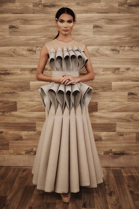


In some ways, it’s a miracle Sebastian has made it this far. Not because he lacks the design skills and vision. We think he’s the most talented and worthy of the final win out of any of the remaining designers. But man, he does NOT do well when you impose goofy reality competition challenges on him. Conceptual stuff or imposed restrictions tend to send him spiraling into meltdowns. His room concept was pretty awful. His dress was gorgeous and a technical masterpiece, but he was pretty open – as were several of the other designers – about how he was simply trying to recreate something the judges liked before. It’s impressive as hell, but the whole project smacked of someone who was running out of steam.
Bishme


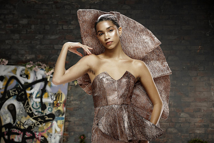

Bishme’s conceptual space didn’t seem to come together the way he wanted it and unfortunately it didn’t make much of an impression. His concept of a rose breaking through the concrete is a solid one, but it wasn’t as effectively rendered as it could have been. The design is strong and fairly well realized. We didn’t agree with Brandon’s critique of the peplum. It’s just right for balancing out the back piece. Our only real quibble is that the fabric choice wasn’t great.
Hester


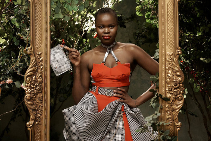
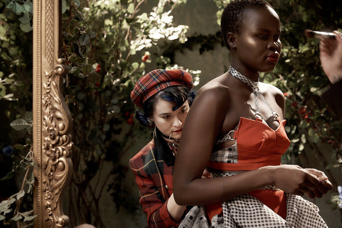


It’s not at all surprising that Hester’s conceptual space was the richest and most evocative. Say what you will about her, but the woman’s definitely got imagination and vision. To be fair, it did tend to come off like a well-presented department store window design, making it our second-favorite conceptual space. And unfortunately, she has terrible time management skills and tends to throw everything at a design when she gets stressed out. The skirt is okay, but the bodice is a horror. Trying to tie the booties in with those weird plaid leg-warmers is annoying. The footwear was fine on its own. You don’t have to Hester up everything in sight.
Garo Sparo

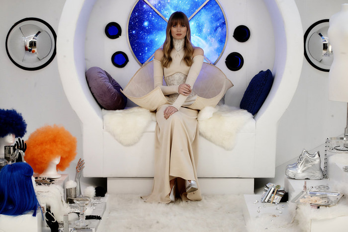
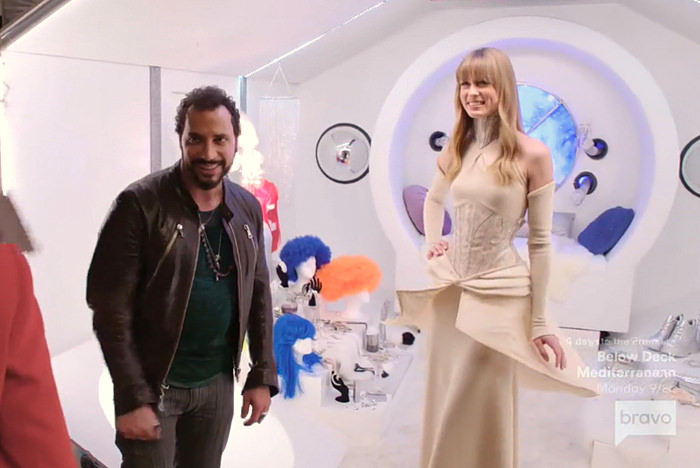
Garo absolutely killed it on the marriage of conceptual space and design. Of all the projects, his married the concept of the space and the design of the garment best. She looked like she lived there. We have no problem with giving him the win, even though we don’t love the dress as much as the judges seemed to. It’s sleeker (when you take the peplum off) and elegantly restrained in a way prior designs didn’t manage. The judges like to see someone show growth and evidence that they’ve pushed themselves harder, which is probably a big reason why they gushed so much over it.
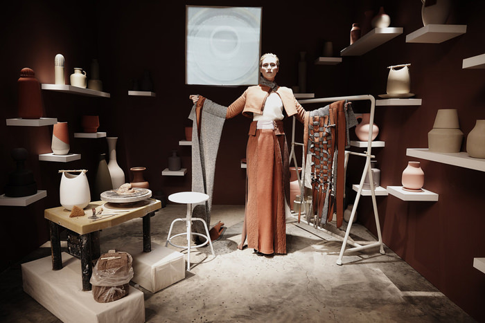

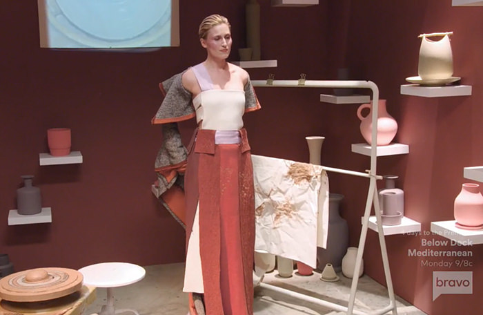
Tessa more than anyone else tended to approach this like an avant garde art challenge, which is admirable, but the results weren’t so hot. The space is nice and the design integrates well with it, but in the end, she just looks like she’s modeling textiles in an art studio. The judges apparently wanted something wearably marketable and she gave them something that’s supposed to be posed and observed. It might have worked if she’d given them something stunning to look at, but it just comes off like swatches and scraps. And to be honest, we don’t think it showed good instincts to splatter it with clay. Ruining an expensive hand-made garment is not the kind of thing Nina or Linda Fargo were going to respond well to.

Strange how sausage-heavy the finale’s going to be. At the beginning of the season, we never could’ve predicted that Hester would be standing at the end and Tessa wouldn’t even get the chance to make a collection.
More thoughts in today’s podcast:
[Photo Credit: Karolina Wojtasik/Bravo]
Style File: “Big LIttle Lies” Star Laura Dern in New York Next Post:
Michelle Williams and Sam Rockwell at FX’s “Fosse/Verdon” FYC Event
Please review our Community Guidelines before posting a comment. Thank you!

