The New Project Runway continues to do an impressive job of marrying storytelling to the design and inspiration process, avoiding some cheesy reality television pitfalls and bringing in a welcome new twist.
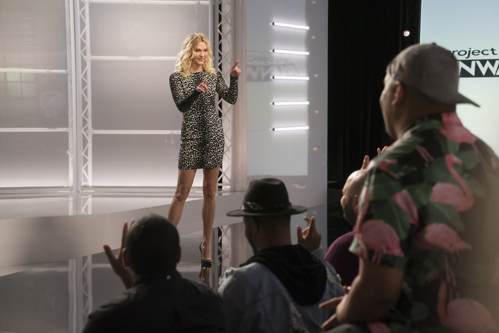
The show returned to its “host stands on the runway to explain the challenge” format after a couple of weeks of highly staged challenge introductions in the work room. The challenge itself had a similarly low-key aspect to it. Basically: “Head-to-toe print looks are hot in fashion right now, designers. Do that.” There’s something a little refreshing about a challenge that is purely design and trend-based, without any flaming reality hoops to jump through or last-second twists foisted upon the designers. Sure, they reduced the deadline to one day, but they were bound to do that sooner or later (they’ve been doing it since the first season, after all) and the challenge was so simple in its parameters that no one really seemed to struggle with the time crunch that much.
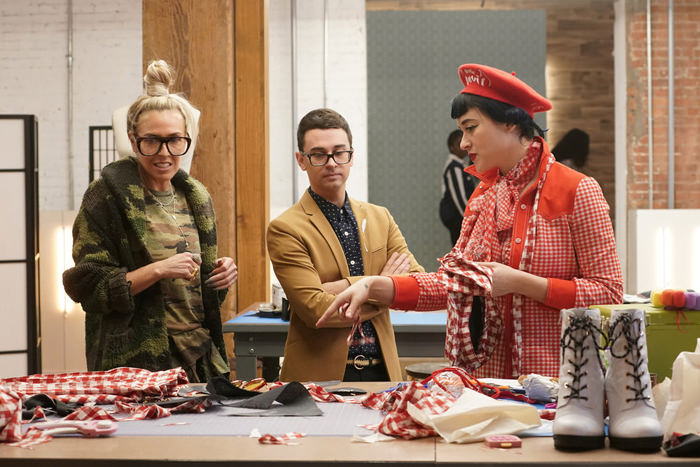
Bringing in a stylist for design consultations is a brilliant move; one that places the competition that much closer to the real world of fashion design. Marni Senofonte has just enough of an impressive background to make her presence welcome and enough savvy to make her advice usable for the designers. Christian is practical and problem-focused, but bringing in Marni – who’s perfect for reality TV, by the way; colorful, full of personality, and sharp – adds a whole new dimension to the process and allows the show even more time to focus on how the designers work and what kind of issues they’re facing.
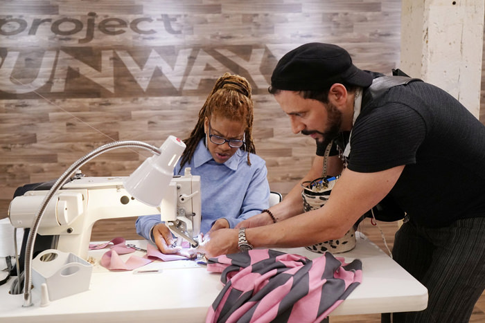
The new PR also continues to impress us with its casting this season. Only a handful of designers have shown themselves to be among the ones to watch, but it’s early days yet and every season, even the bad ones, had to cycle through the cannon fodder before we got to the good stuff. But overall, the designs this week were smoothly professional (mostly) and even occasionally chic and of-the-moment. But what interests us more is the camaraderie of the cast; something that seemed to be discouraged in latter seasons of the show. It’s genuinely entertaining to see them rally around each other, help each other out, and cheer each other’s triumphs without much drama and without any evidence of backstabbing or arguing.
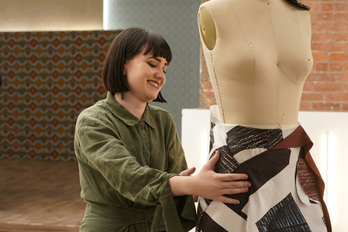
We keep saying this, but it bears repeating: Nu-PR took some cues from two of the most popular reality TV competitions of the moment; the storytelling of RuPaul’s Drag Race and the simple joy of watching people create with an accompanying downplaying of drama a la the Great British Bake-Off. So far, it’s really working.
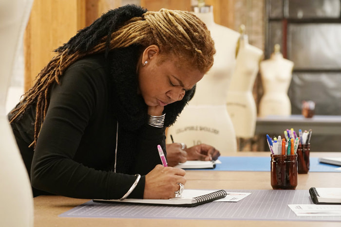
Nadine handed them several reasons to cast her as a villain and enough eyerolls and sound bites to edit her into the kind of character reality TV fans love to hate. And while we can’t say she ever came off as a particularly joyous or likeable person, we think the editing gave her room to explain herself and at the end, while she was kind of rude about it, she was clear that she just wasn’t cut out for reality television; a revelation that doesn’t get expressed as much as it should by people eliminated from a competition. The fact that all her colleagues felt bad for her and no one had any “I’m glad she’s gone” sentiments to express is a tribute to how the show is handling drama this time around.
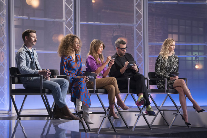
Attached to this gentler, more creativity-focused approach is a renewed judging session in which the panel doesn’t just critique the designers’ current work, but offers them broader advice on career, inspiration, and professionalism. Brandon in particular is very good at passionately explaining his critique or offering usable advice going forward. He and Nina are the focal point of the judging, much in the same way Nina and Michael Kors used to be in the show’s heyday.
Let’s run down the offerings. First up, the folks who didn’t rate a critique and were waved through as safe:
Bishme
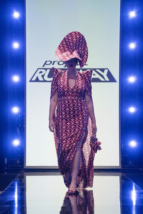
And we’re kicking off with what we’d consider one of the worse looks of the week, from the flimsy-looking fabric, to the ugly silhouette and unworkable hat, this is all pretty bad.
Jamall
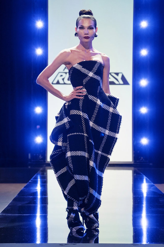
It’s a potentially interesting design concept that’s been absolutely murdered by the awful choice in fabric. How can you look at that textile and not see a blanket?
Renee
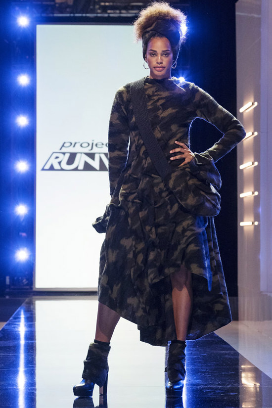
A competent and well-realized design that fails to make an impact partially because the print is so muddy and uninteresting. Camo is a cliche in fashion.
Lela
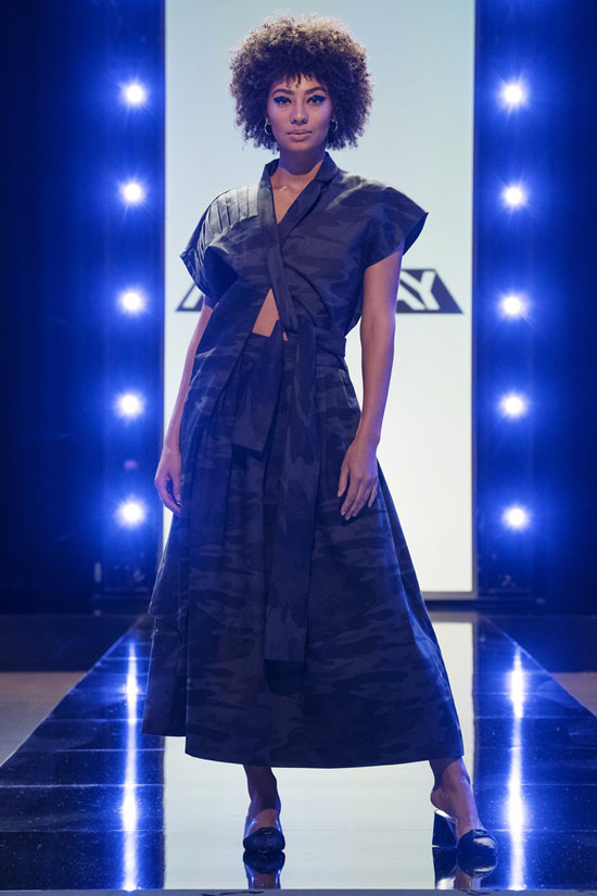
Ditto. This could’ve been a lot more interesting to look at in a vibrant print.
Tessa
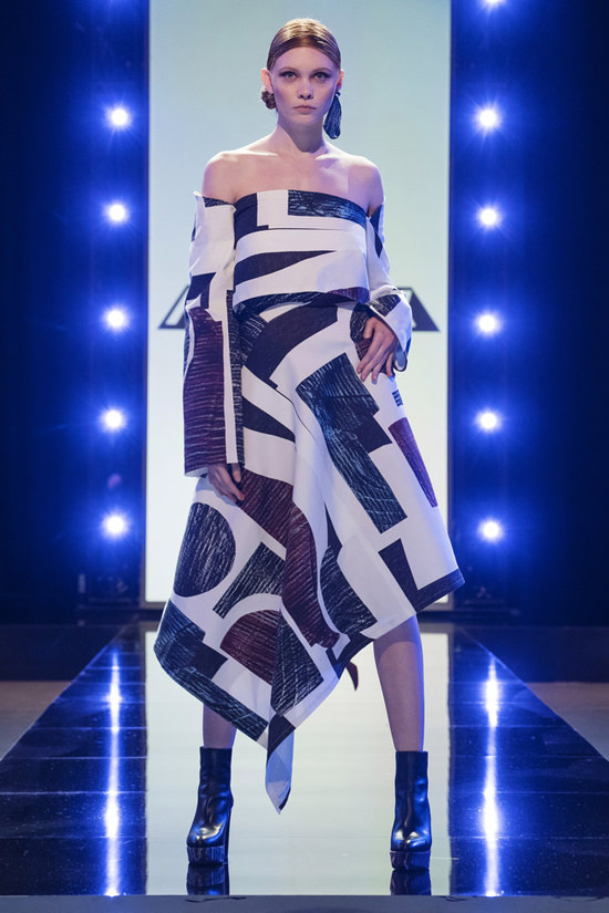
She basically fell apart at the prospect of working outside her minimalist safe zone. This doesn’t look like her aesthetic at all, but it’s just bare-bones good enough to get her through. The print is ugly and looks like curtain fabric.
Sonia
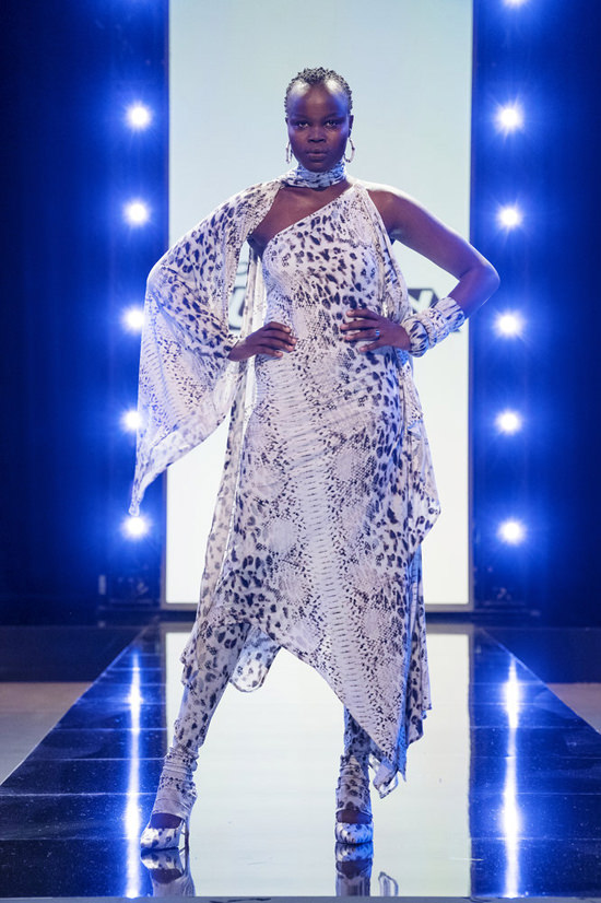
Once again, we’re impressed with Sonia’s work, which comes off very of-the-moment and very polished. This looks ready for retail to us. Again, it’s probably not getting more attention because of the generic print choice. Seen it a hundred times. A thousand times.
Venny
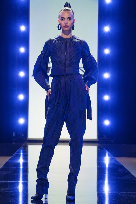
It’s a damn shame some of these designers have such a poor eye for prints, because this is another fantastically designed look that only barely rises to the challenge brief. We can’t even tell it’s a print at all. Great look, though.
Afa
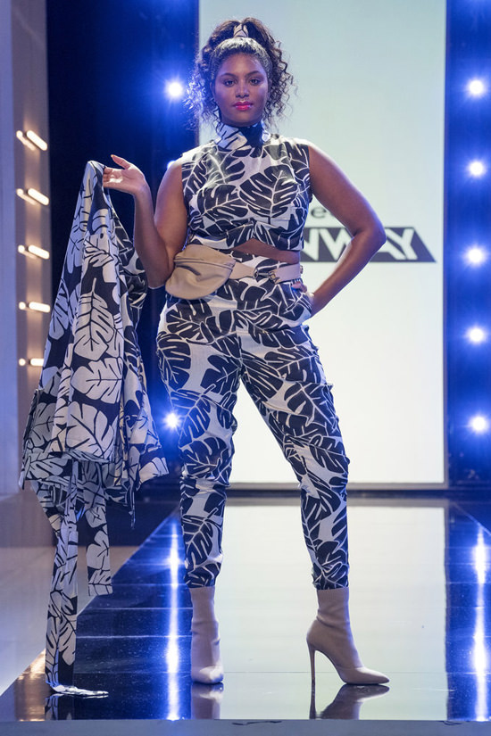
Kind of awful, to be honest. A bad print, a mumsy design, and he didn’t do a thing to use the print in the accessories, which was a major component of the challenge. He could have easily wound up in the bottom for this. Fortunately for him, there were three looks the judges hated more:
Garo Sparo
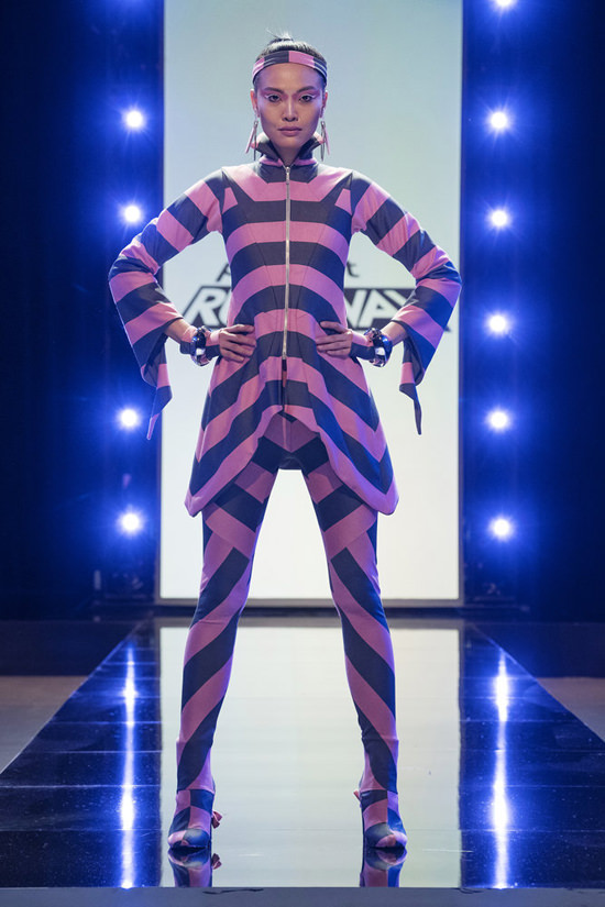
Oof. He got so caught up in impressing the judges with his technique that he completely blew past the two much more important aspects of the challenge: picking a good print and utilizing it well. He said he was going for ravewear, but this looks way more like ’80s activewear. There is some impressive design and seaming work here, but the textile and style are terrible.
Rakan
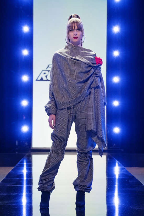
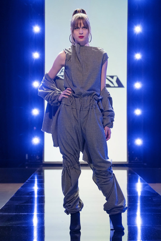
He really thought he was doing something here. Again, whatever potential interest his design might have generated was absolutely ruined by a piss-poor textile choice. If he had picked a modern sort of print, some of his design choices might have worked better, but even so, it wouldn’t have saved this look from being wildly overdesigned and in great need of editing.
Nadine
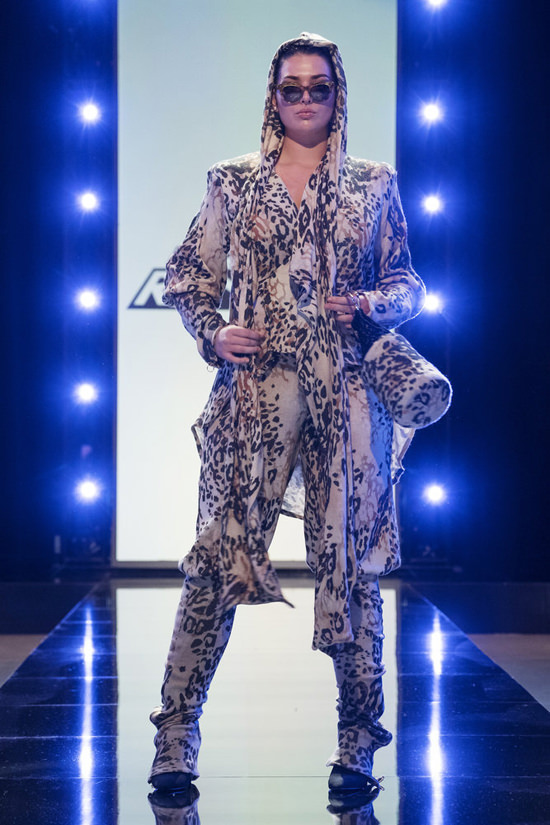
A poor textile choice followed by a series of poor design choices. To be honest, we don’t think this is the worst thing on that runway. We think he somewhat unprofessional manner of discussing her choices and her attempt to blame them on her model’s size and shape are what did her in most. It was great to see Brandon firmly call her out on that behavior.
HIGHEST
Kovid
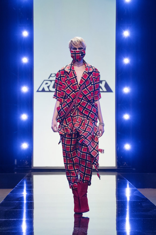
Sorry, but we thought this was WILDLY over-praised and we got the impression the judges are a little too charmed by Kovid’s wide-eyed, childlike act (which is really close to its expiration date for us). The print is ugly and we absolutely hated the way he cut out pieces and just had them dangling off for a 3-d effect. We’re all for a design manipulating a print in order to produce an effect not found in the print, but this just looks like a pile of fabric to us.
Sebastian
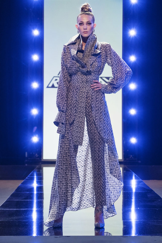
This is a far better example of a designer using a print to produce forms and shapes in the design. It’s a stunning look and Lorenzo was screaming on the couch when it didn’t get the win this week. Honestly, it’s hard to imagine why it didn’t except a more colorful designer had a better story to tell with her work.
Hester
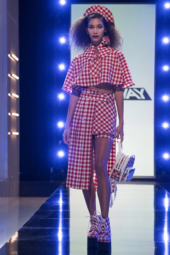
There’s some disagreement between us on this one and you’re going to hear us bicker about it in today’s podcast. It’s gimmicky and the textile looks way too much like a picnic tablecloth. But the brief was editorial and this nails that nicely – even more so than Sebastian’s chic look, which was perhaps just a little too understated. This does, in fact, look like something you’d see on the pages of a fashion magazine. And Elaine rightly noted that most of the pieces are very wearable and saleable, once you break them apart. The shoes, the capelet and the hat are really cute. More important – both from a design and a storytelling point of view – this was about a designer finding her voice and nailing the challenge while remaining true to it. That’s the kind of thing reality TV competitions live for.
More thoughts in this week’s podcast:
[Photo Credit: Karolina Wojtasik/Bravo – Video Credit: BravoTV]
Lupita Nyong’o in Dorothee Schumacher at “The View” Next Post:
Lupita Nyong’o in Adam Lippes at “The Daily Show with Trevor Noah”
Please review our Community Guidelines before posting a comment. Thank you!

