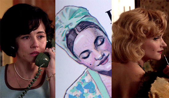
In a way we’re grateful that there were some rather too-obvious costuming and makeup choices made this week, such as the BEAUTY MARK OF DON’S DOOM:
Because we feel like we’ve created a small army of color and costume-obsessed monsters and we think it’s time for a mid-semester review, so to speak.
You see, after making a point of pointing out all the notable instances of blue and green popping up this season, we suddenly found ourselves fascinated by all the blue and yellow showing up in scenes last week. But in reading the comments to our Mad Style post, we realized we hadn’t done a good enough job of explaining (or re-explaining) our…we’ll call it “position” for lack of a less formal word. There were parallel responses to our post last week; one that brought up the question of “intent” and one that addresses the question of applying or finding meaning in the costuming choices.
To start, let’s go back to something we said at the start of the season in an attempt to frame the “Mad Style” discussion:
“Mad Men is one of the most analyzed shows on television and probably, when all is said and done, one of the most analyzed in the history of television. The downside to that can be an awful lot of over-analyzing. And we admit we’re as guilty of it as anyone. But the point to this kind of reading of the show is to deepen the understanding of it; to open up the conversation and demonstrate that there’s more to a filmed narrative than just the text or the acting. It’s not to crack open a code and find a hidden meaning inside like a prize in a Cracker Jack box. There are multiple layers and multiple meanings in any text of any depth. The best anyone can do when analyzing it is to understand that and accept that they’re bringing their own interpretation to it. There are times when we can fairly definitively say what the intent of the costume designer, Janie Bryant was, but it’s more important in this kind of analysis to sometimes separate the intentions of the artist from the work itself and see what the work is saying independent of them.”
In other words, it misses the point to ask if Janie Bryant had a specific meaning in mind when she dressed everyone in certain colors. We think we may have misled some of you with all our “WHAT DOES IT ALL MEAN?!?” talk of last week. It’s really up to us to decide what it means when certain motifs repeat, just as it’s mostly up to us to determine how deliberate they were.
There’s no right or wrong way to approach this sort of thing, but we’ve always maintained that applying external meanings to color motifs is not really our bag; the whole “in some cultures, green represents…” kind of reading. Again; nothing wrong with that, but that’s not what we’re doing here. Instead, we’re looking for meaning within the story. Red might equal passion or anger in an external sense, but in the season 6 story of Mad Men, it quite clearly represents prostitution to Don. Similarly, purple might represent passion or royalty externally, but in seasons 2 and 3, it clearly represented heartbreak to Joan. Which brings us to our next point: we don’t think you can apply such readings across the board. Purple meant something specific to a certain character during the story, but then it kind of lost its meaning as that part of the story (Joan’s relationships with Roger and Greg) moved to the back burner. Red, blue, yellow and green are repeating motifs this season but that doesn’t mean we’ll be able to unlock a hidden meaning that will explain their use in every case.
See? It’s frustrating, because it’s never going to be exact, nor is it ever going to unlock that secret meaning to explain everything. Does B&G “mean” adultery? Who knows? But isn’t it fun looking for scenes where the two themes overlap?
As for intent, that one’s a little easier to nail down. There was a lot of “Well, aren’t they wearing yellow because it’s spring?” type responses to our post last week, or even comments that questioned whether the preponderance of certain colors was just a coincidence. Again, it doesn’t particularly matter whether it was intentional or not to us. It matters more how the scene comes across after the fact and what can be gleaned from various choices made by the creators.
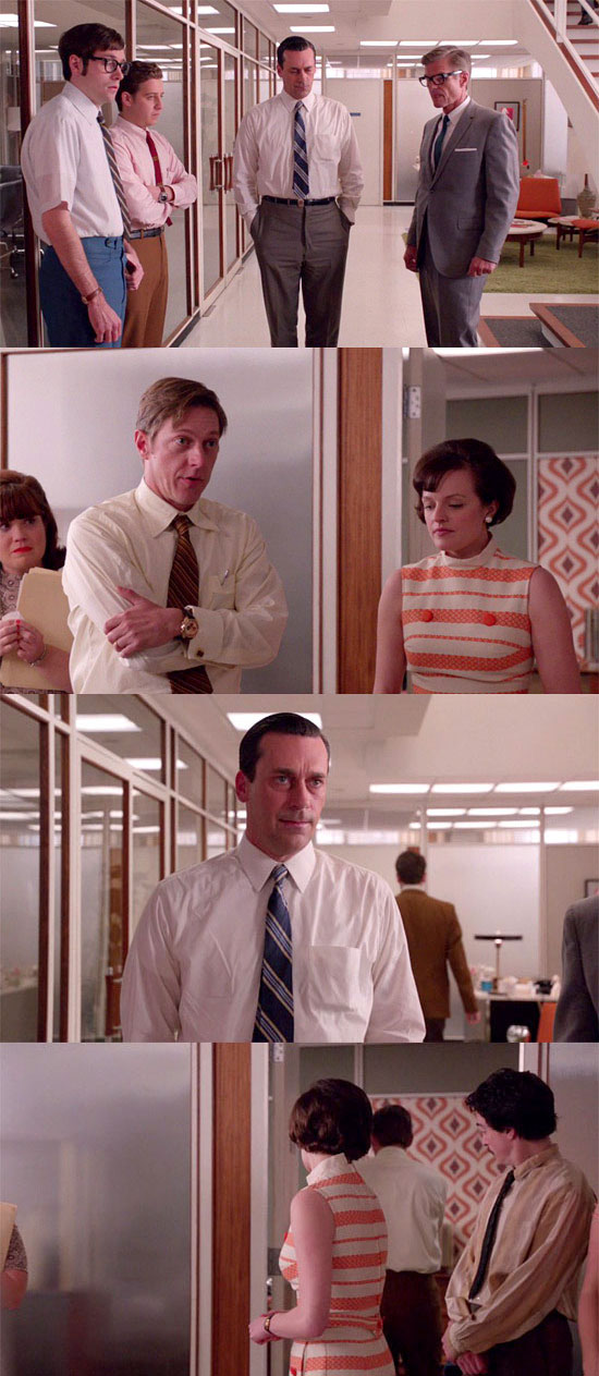
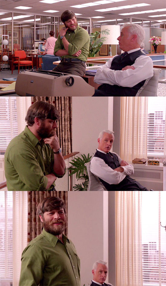
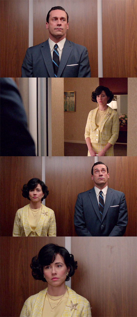
Having said that, we maintain that the color motifs we’ve pointed out this season have been deliberate, even if we wouldn’t go so far as to propose that Janie Bryant has a strict “Yellow = x concept, Green = y concept, Blue = z concept” color map. Sometimes a creator merely comes up with a motif and sometimes in analyzing it, pointing out that the motif occurs is enough. But in order to “prove” intent, we offer the following. Here’s the creative department last week, all done up in yellow and blue, as we pointed out:

And here’s the much smaller creative department this week:
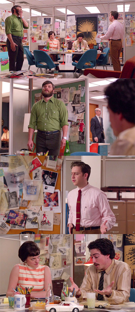
It is much, much more common for Janie to dress multiple characters in a scene like this, where the clothes don’t always match or call back to each other in any way. It’s very unlikely to have a scene like the one from last week, where they were all done up in just two shades; two shades that kept repeating over and over again throughout the episode. As you can see from the above shots – and really, any group shots this episode – there really weren’t very many colors off the menu for summer 1968. Janie has the entire color wheel at her disposal, so when she restricted those choices down to two and then repeated those two in every scene, we think the question of intent answers itself.
Okay, onward to this week.
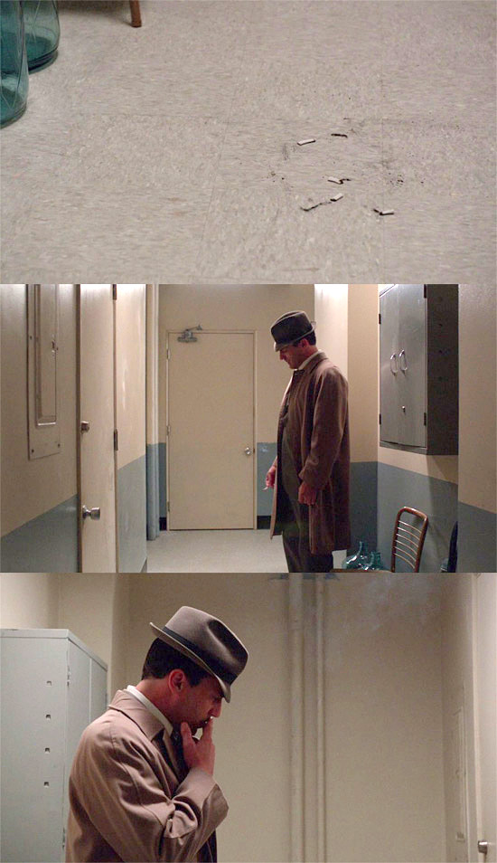
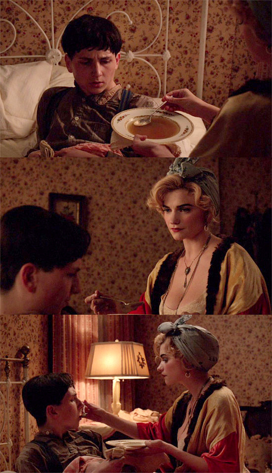
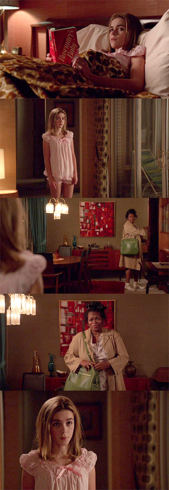
A man at one with his drab, utilitarian surroundings. He is a picture of depression, all done up in neutrals and grays to match the hallway he’s standing in. And what’s on the other side of that door?
Color. And life. Everything he wants.
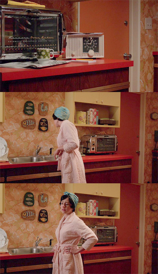
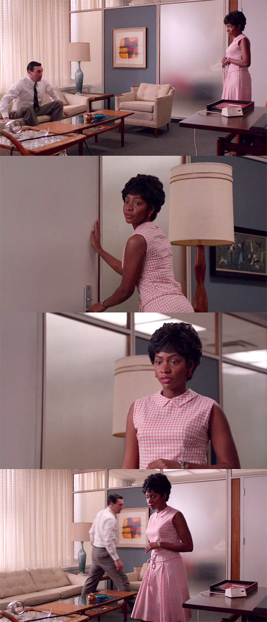
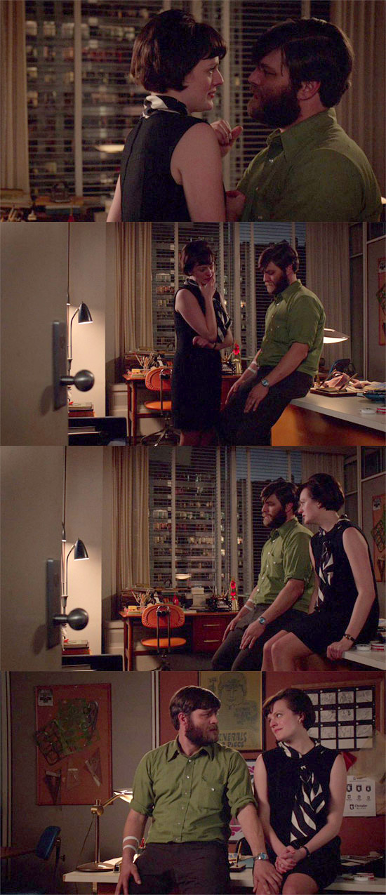
Many viewers quickly noticed the head scarf motif that repeated on Sylvia, Aimee, and the mom in the oatmeal ad, just like they all sported beauty marks:
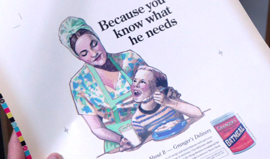
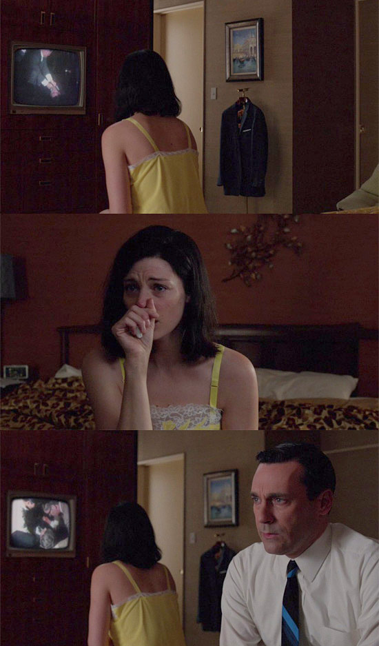
Well done, grasshoppers. But did you notice how much the pink and pale blue Sylvia’s wearing in the kitchen scene repeated over and over again?
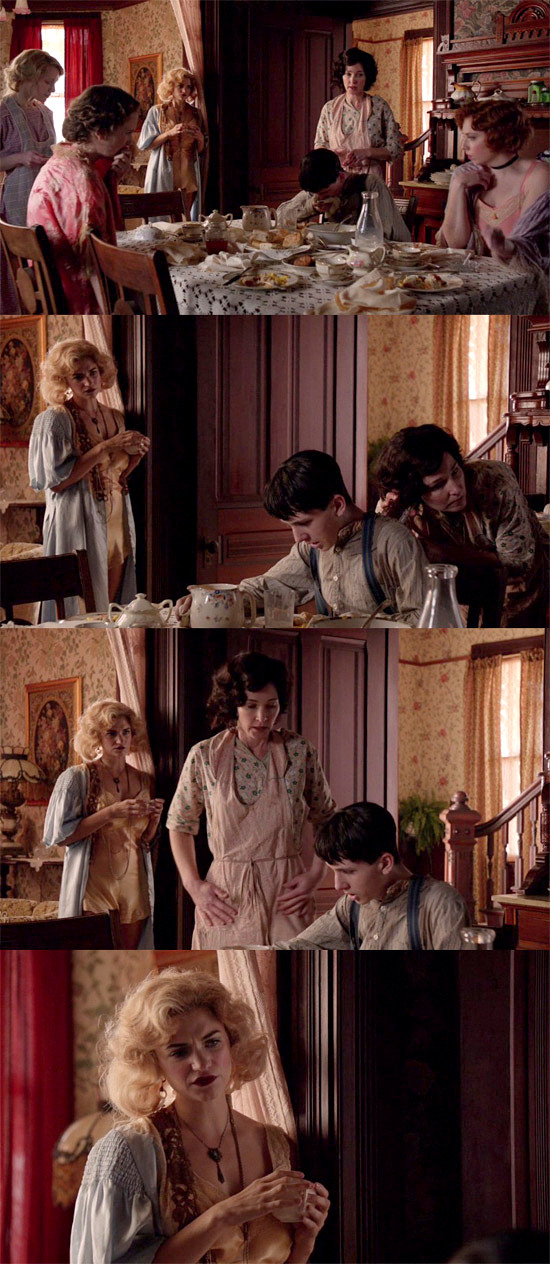
Both colors were all over the costuming in this scene – and all the scenes with Aimee. It feels silly stating it, since it was so obvious, but Don clearly mixed up Sylvia and Aimee in his head in a lot of ways, and that only became something he was aware of this week, in a drug-fueled mania. Some saw that as a breakthrough on Don’s part and we’d probably agree, except Don’s had breakthrough moments before, that pretty much amounted to nothing in the end.
In many ways, we kinda checked out this week, because the theme-hammering was so loud it was starting to give us a headache. If you read our initial review, you saw that we enjoyed the episode quite a bit, but did not find the flashbacks particularly revelatory. Once you establish that Don grew up in a whorehouse, it’s not hard to figure out that his sexual and woman issues were probably initiated there, in exactly the way they turned out to be.
What interests us here is not that parallels are being drawn between Sylvia and Aimee, but that Don literally doesn’t see them. He can’t see Sylvia on the other side of her kitchen door, so the pale pink robe and blue head scarf can’t trigger his Aimee memories for him. These symbols and motifs are not subjective to Don and happening inside his head, in a Freudian sense (like the “red triggers Don’s prostitution issues” motif). These symbols and motifs are being put forth objectively, by the universe, in a more Jungian sense.
Consider this:
Heavily laden with meaning in Don’s life, right?
But it’s repeating here, in the most disturbing way possible:
And totally independent of Don’s knowledge or perception.
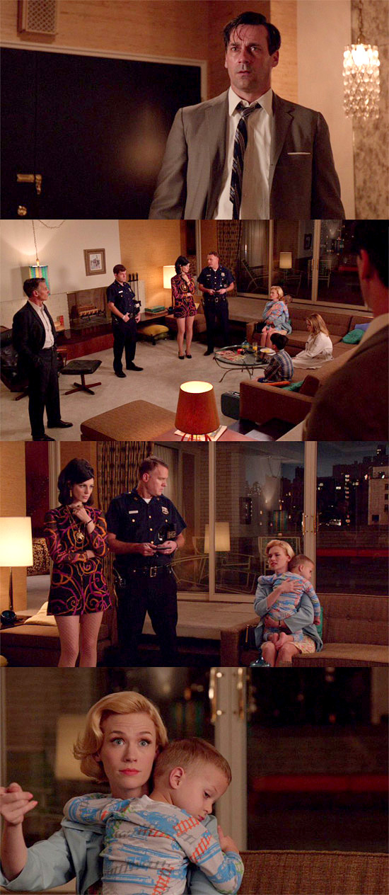
The point isn’t that there’s a parallel between Sally and the prostitute who molested Dick; the point is that the entire world right now is off-kilter and disturbing; even threatening, which is how a lot of the characters feel at the moment. If there’s any connection between the two scenes, it’s a sense of loss of innocence. In Dick’s case, that’s literal and obvious. In Sally’s case, it comes with the realization that her father is a stranger to her.
This vaguely threatening, disturbing, off-kilter feel is then picked up by Ida’s purple print dress, which refers back to this scene:
By repeating the motif of an interloper in a purple print; a woman who “shouldn’t be there” (as both Don and Sally said), who threatens the status quo and plays upon the fears of upper-middle class whites; the hippie chick and the scary negro.
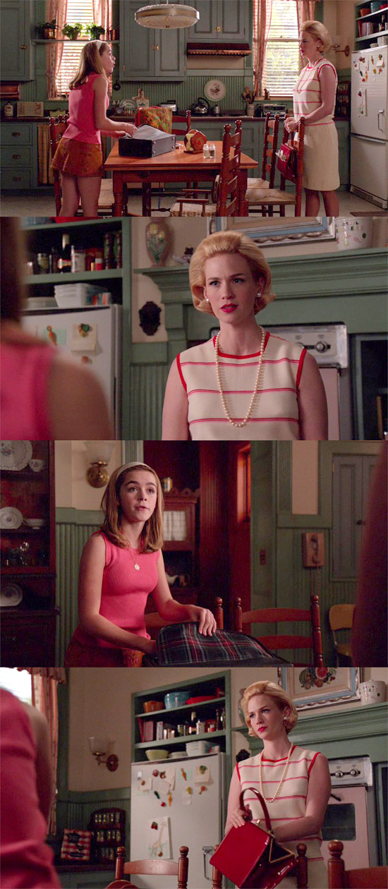
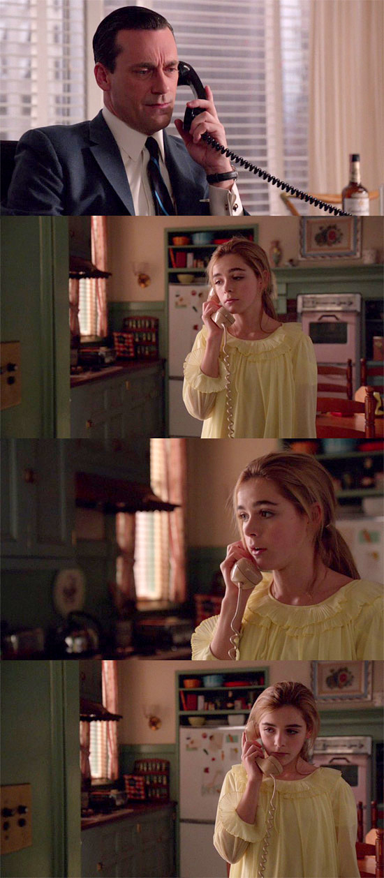
In this scene, Sally’s again in a pink and this time, her mother literally compares her to a prostitute, asking her what street corner she worked to get that skirt. Again; this connection of pink to prostitution is happening independent of Don, unlike the times in the story when red signaled prostitution, which always occur subjectively, inside Don’s head.
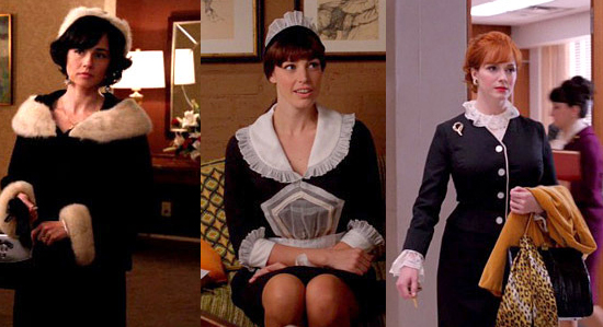
Betty was on fire this week, wasn’t she? We’re thinking she’s been popping some Mother’s Little Helpers Uppers to get that perfect Candidate’s Wife look.
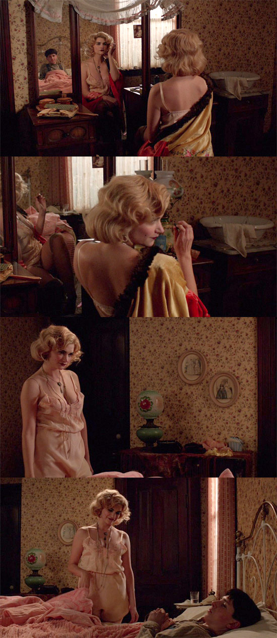
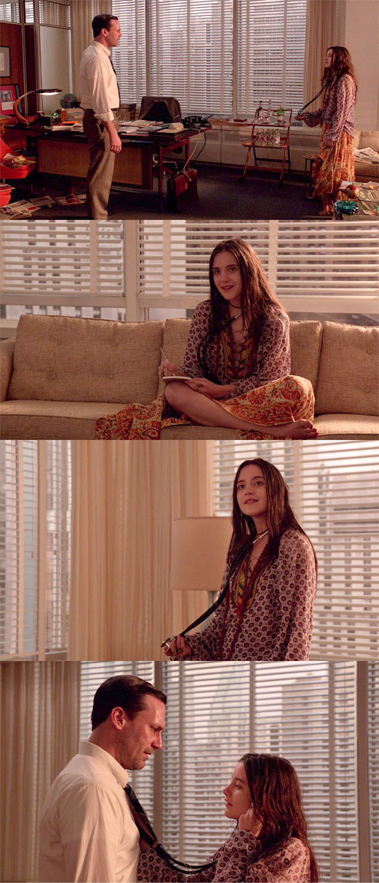
So what is happening subjectively, inside Don’s head? Aimee isn’t just a prostitution figure to Don, she’s also a mother figure, as is Sylvia to him.
And the pale blue of his memories bring up comforting feelings alongside the darker ones, which is why it appears in the oatmeal ad and why his reaction to Moira here was so euphoric.
Similarly, there’s nothing sexual or prostitution-tinged about Dawn’s pink dress. She’s attending to Don like a mother figure would; like Aimee feeding him soup or Sylvia asking Arnie if he wanted cold leftovers. Red was a very clear and consistent “whore” signal this season, but the pinks and blues of this episode depict the way Don confuses prostitution and motherhood.
So when he stumbled into his home only to be unexpectedly faced with his whore of a wife (as he sees her) wearing pink and the mother of his children wearing pale blue, it’s no wonder he fainted dead away. The themes got so heavy he collapsed under the weight of them.
Okay, enough of Dick Whitman’s Carnival of Bullshit. How’s Peggy doing this week?
Well, our gal’s clearly all grown up. Her wardrobe this season is radically different. For years, the only pattern you ever saw Peggy in was a schoolgirl plaid, but she’s starting to wear more vibrant prints and brighter colors. This makes sense, after all. It’s 1968. But it also makes sense because she’s so clearly hit a maturity level that sets her apart from a lot of her co-workers. There’s something very confident and business-like about the way she dresses now.
Having said that, you’d never see nipple buttons on a dress today.
She looks grownup now. And not in a “trying to look grownup” way. She’s almost 30 years old, with almost a decade of advertising experience under her belt. She owns a house. She’s in a long-term relationship. She got everything she wished for when she once enviously said to Don, “I look at you and I think, ‘I want what he has.’ You have everything. And so much of it.”
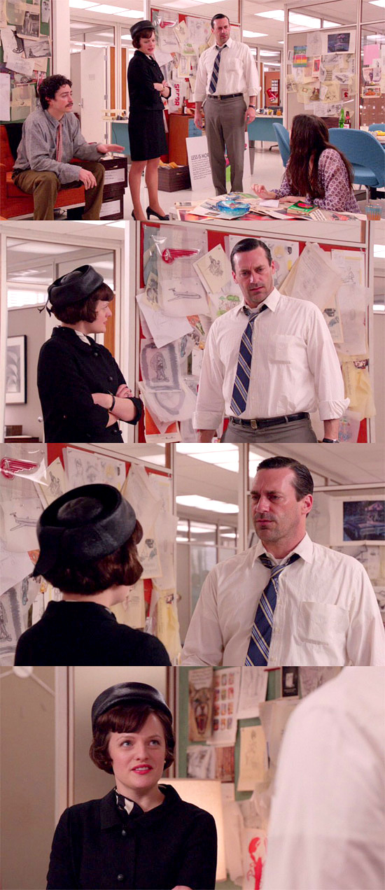
This outfit of course continues the theme of women in black, which we feel refers to the assassinations of the period. It’s also notable that the theme could more accurately be called “women in black with white accents,” as we saw here:
And if you really want to hold on to the “blue and green signals adultery” idea, Stan is wearing a green shirt and a blue belt:
Although to be honest, we’re more interested in the moments when these color motifs repeat in separate outfits, rather than in one outfit:
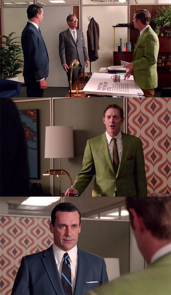
There’s a sense of these colors facing off against each other. Notice how even Jim’s tie is a colorless grey. He’s meant to fade into the background so that all our attention is on the blue figure and green figure in the scene.
We thought perhaps there was something confrontational about the use of blue and green here; a sense of facing off. Just like there seems to be something of a lack of confrontation in the blue and yellow combo:
This scene mimics the one last week, when she walked off the elevator wearing yellow, leaving him behind in his blue. But it’s also about the lack of a connection, or at least the refusal to acknowledge one, which reminds us of this scene from last week:
When there was clearly no connection between these two. And it also carries forward into this scene:
Which is ABSOLUTELY about the lack of connection between these two.
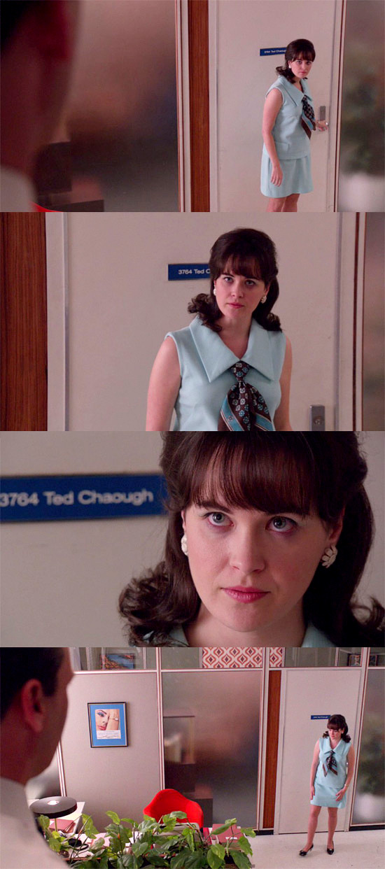
So it might actually be a good sign that Ted’s in green this week instead of yellow. It’s better to have Don confronting you than to have him blowing you off. And perhaps all that blue and yellow last week was about the ways in which SCDP and CGC were failing to connect, just as Don and Ted were failing to connect. Similarly, you could take the green-and-blue thing and make it about connecting and confronting, instead of about adultery per se. It works for certain notable B&G scenes, like the Ted and Peggy ones or the Sylvia and Megan one, the Trudy and Pete one, or even the Joan and Dawn one. You could take it even further and note that the blue and green in the oatmeal ad lady’s outfit represented the way in which Don confronted his madonna/whore issues with Sylvia.
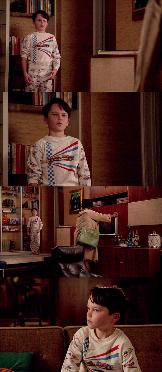
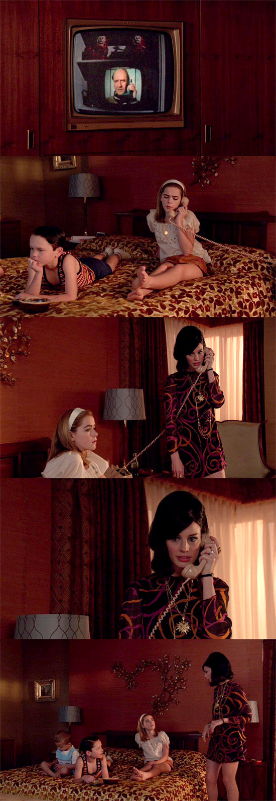
BONUS PICS: Bobby pajamas (which we had 40 years ago and which we find ourselves wanting to own again) and Megan’s ridiculously fabulous dress, just because:
[Stills: tomandlorenzo.com]
Previous post:
Mad Men: The Crash Next Post:
Mad Men: The Better Half
Mad Men: The Crash Next Post:
Mad Men: The Better Half
-

RUPAUL’S DRAG RACE ALL STARS: HOW-TO VIDEOS
-
Pop Style Opinionfest: Saying Goodbye to HACKS and Hello to WIDOW’S BAY
-

The Bitter Kitten Movie Club For June 2026
Please review our Community Guidelines before posting a comment. Thank you!