Darlings, welcome to Mad Style, Phase 2. Here’s how it works: we’re going to continue the Mad Style series until we go insane or until our typing fingers fall off. Phase 1, will continue with retrospectives on various characters like Kitty Romano, Helen Bishop, various prostitutes and strippers, a look at the underwear and sleepwear, and an examination of all the male characters. Figure on about one of them per week, probably on the weekends. Phase 2 will be all about taking a look at, well, everything we just saw in that week’s episode.
There’s a reason we’re separating them out that way. Phase 2 posts won’t be character-based and they won’t have recaps of that character’s arc. In fact, they won’t be as heavy on analysis because we don’t know yet where these characters are heading. That kind of analysis comes when the story (or the season) is over. For these posts, we’ll point out how characters have changed their looks and try to put them in a little historical perspective. We’ll also point out the ways each character’s looks, no matter how much they’ve changed, are still very much in character. And finally, just because, we’ll occasionally point out non-clothing items and props that look fabulous. So let’s get to it.
There was a noticeable shift in fashion, in home decor, in film, television and music, during the period immediately following the Kennedy assassination and the arrival of the Beatles on the American scene. In short, what we all think of when we think of what the ’60s looked like really had its genesis during this period: pop art, swinging London, mini-skirts and beehives; more color, more pattern, more experimentation with forms; more of everything, really.
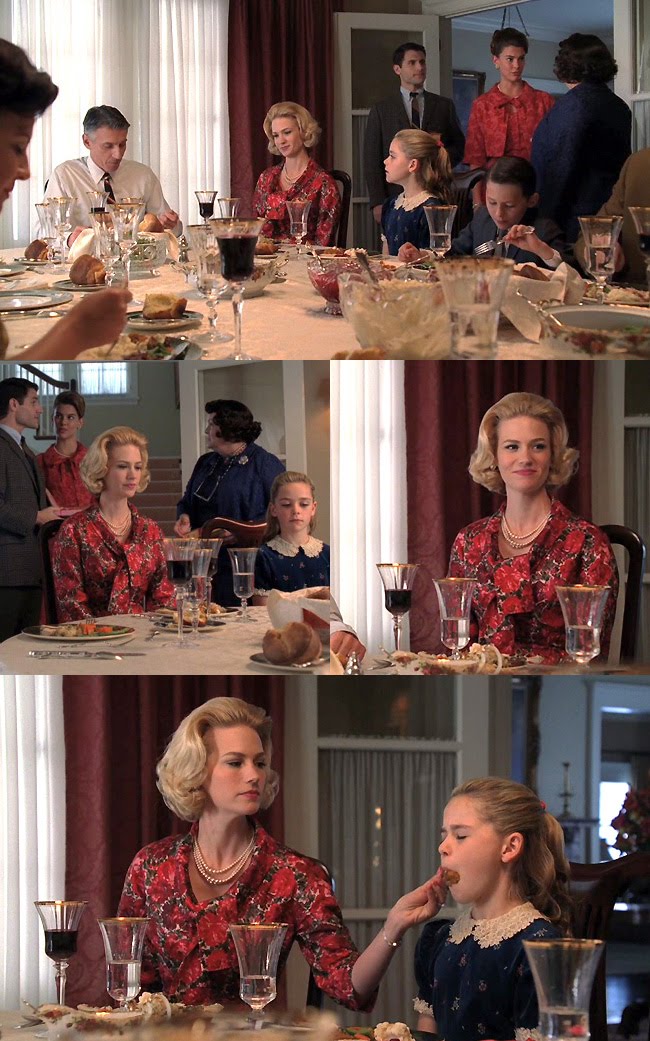 No character changed her look more drastically than Betty Hofstadt Draper Francis. It’s hard to believe this is the same woman who drove Roman men to distraction not 18 months before. You could argue that part of the reason she looks so much older all of a sudden is because she’s actually trying to look closer to her husband’s age rather than her new step-daughter’s. No doubt that’s partially true, as is the explanation that as the wife of a high-ranking political advisor in the Republican party, she would be expected to maintain a look long-classified as “political wife.” But the thing is, women of the period like Betty; suburban, upper-middle class, obsessed with appearances, naturally settled into an early matronhood. Yes, she looks “old” to our 2010 eyes, but in 1964, she would read as “respectable.” And “respectable” is really what her transformation is about. We noted when we analyzed her looks from the 2nd half of S3, she slowly morphed from trophy wife/movie star looks (which befitted her comparatively more glamorous life with Don) to Chanel-like suits that screamed respectability when she started her affair with Henry.
It’s notable that Betty has something of a pink rose motif working its way through a lot of her outfits. This is the first time we’ve seen in a red rose print. And of course the hair is pure Lady Bird Johnson.
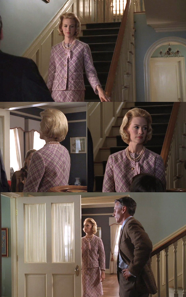
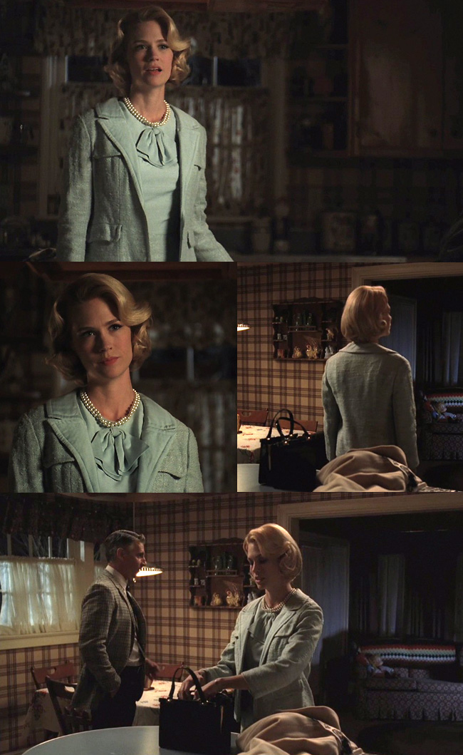
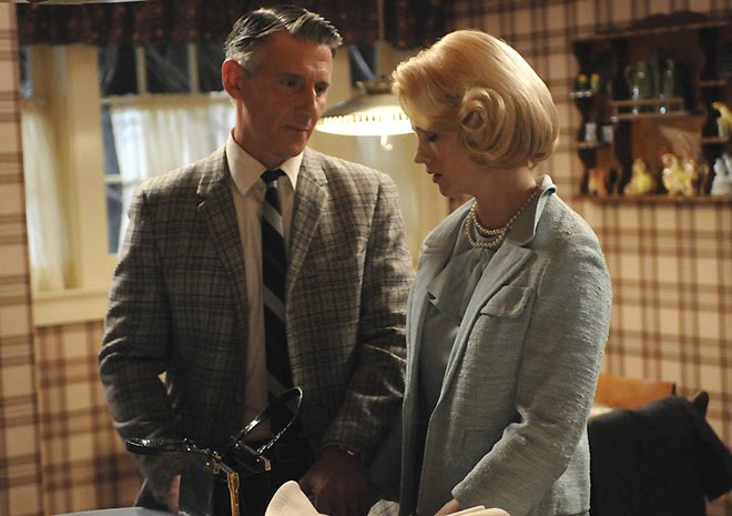 She still has a fondness for pale feminine colors, but she’s obviously settled into a uniform. It’ll be interesting going forward to see how much she changes it up. It’s amazing how quickly she changed her look when she changed her life.
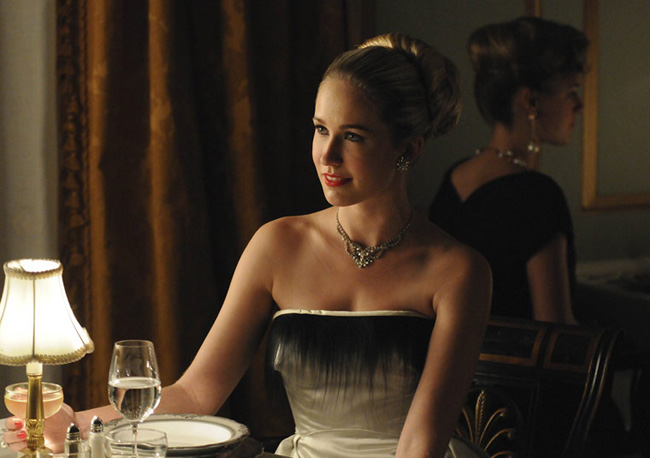
 Here we have Don’s date, who is trying to be an actress and lives at the Barbizon. She blurted out that she was wearing a borrowed dress, which makes sense because this is not a cheap dress and she doesn’t seem to be earning all that much money. Granted, she’s probably the type getting money from Mommy and Daddy until she lands a husband, which would explain the jewelry (assuming that’s not borrowed too).
It’s a gorgeous dress, what little we saw of it. We love the fringe on the bustline. It’s just a little bit of unconventionality that signals the changing of the times.
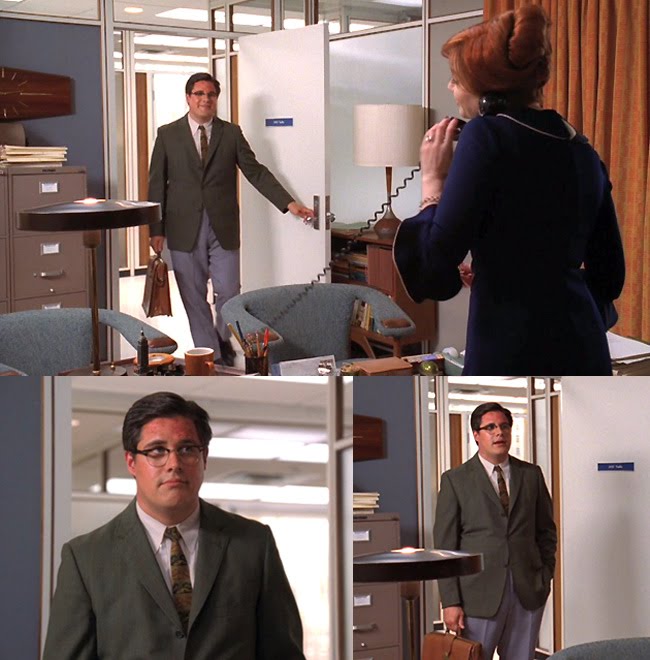 Two things before we get to Joan’s dress. 1) WE WANT THOSE CHAIRS. 2)Believe it or not, Harry Crane’s makeover is almost as radical as Betty’s. Check the two-tone jacket and pant combo. Check the pale blue of the pants against that quintessential early ’60s dusty green. Check the lack of both bow-tie and Brylcreem in the hair. Check the pattern in the tie. Who’d have thought that Harry Crane, of all the men, would be the one leading the charge into ’60s fashion? Compare these pics to what he used to look like.
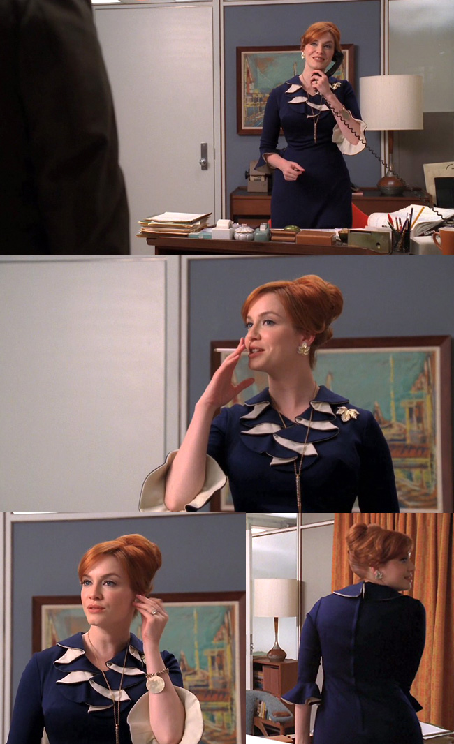 Okay, show of hands: How many of you had a hard time listening to her because you were so busy taking in all the details on the dress? When we last saw Mrs. Harris’ office-wear, it tended to be a little severe for her, with most of the Joan signature details significantly toned down in preparation for her role as doctor’s wife. Now that she’s back in the swing of things (presumably loving it) – and hey, who knows yet what’s going on with that neanderthal husband of hers? – now that she’s back, she’s back to showing a little more Joan flair. She’s not wearing a scarf, but she does have that scarf-like ruffle on the neckline. It’s a typical Joan jewel tone and it’s typically form-fitting. The sleeves are a definite departure for her, very mid-sixties. She’s got one of her brooches, her iconic pen on a chain and something new: what looks like a charm bracelet. In short, she looks like our Joannie, but a little more modern. She looks fabulous.

As for Joey, to be honest, we were a little distracted. As we said, Brylcreem on men’s heads was definitely on the way out at this time and the younger the guy, the more likely you were to see him without it. Still, his haircut doesn’t read as 1964 to us. One of the rare times they missed the mark on this show. Young men were wearing their hair fuller and without product in it, but this is just a little too modern with the lack of a part, the the way top is brushed forward and flipped up, and the slight fade on the sides and back. It’s too shaped. Fresh out of college guys in 1964 had boxier-looking heads than this.
On the other hand, the clothes look dead on.

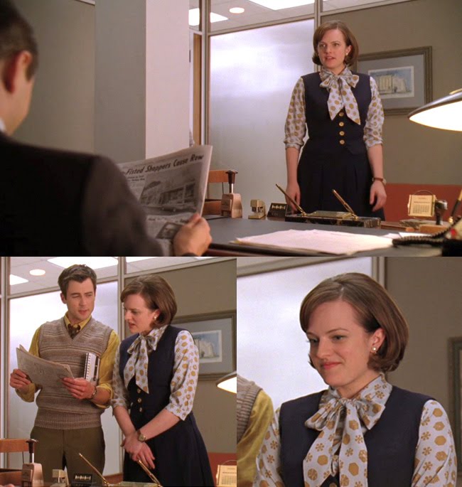
Here’s our first glimpse of the brand new Peggy Olson, confident, competent, and slamming back the whiskeys sitting on her desk. Even though she looks shockingly modern here compared to how she used to look (one word: ponytail), there’s really not a lot new here. She’s in as close to a signature color as she’s ever had (yellow), but this time it’s a more mid-sixties golden yellow instead of the pale washed-out yellows of the late ’50s. She’s still rocking the pussy bow, and she’s trying out a pencil skirt, which is not something she’s worn often in the past. By the mid-sixties, there was a class of working woman who weren’t secretaries and this was as close to a uniform as those women got. It says “career girl” loud and clear.
Love that pop art peacock print behind her. Also in yellow, we might add. It’s not the first time a female character has been tied to her setting, only this time it’s a modern looking setting and she’s thrilled to be there.
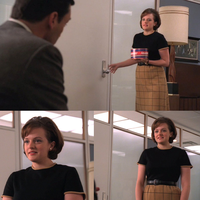
 Those medallion prints were standard from the mid-sixties to the mid-seventies for work wear. You’d see women working in offices as late as 1974 or ’75 dressed pretty much exactly like this. In fact, the entire outfit was a career woman uniform well into the ’80s. Believe it or not, Peggy’s being a little fashion forward here. The vest and pleated skirt are Peggy signature pieces.
 This is a really unusual look for her. She rarely wore sweaters before and the short sleeves and windowpane patterned high-waisted skirt are definitely new for her, as is the somewhat masculine belt (which works for a scene where she holds her own with Don). This was very much a young woman’s outfit. You could see girls on college campuses (depending on the school) wearing dressed-down variations of this basic look at the time.
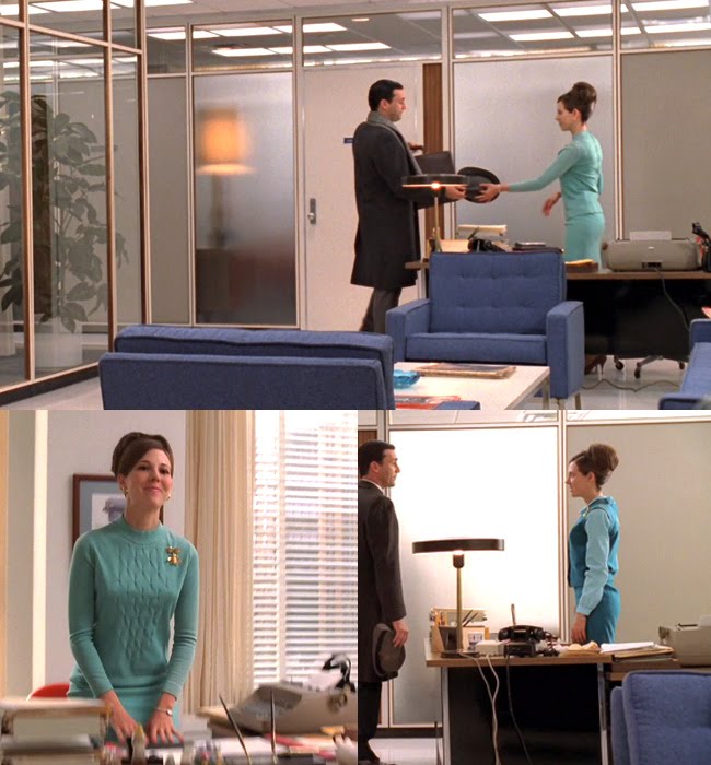 A shot of the gorgeous SCDP reception area (WANT CHAIRS PLEASE) and Don’s secretary Allison, who we were happy to see was rehired and brought aboard. She looks really cute here and way more modern than the girl who let Ken Cosgrove lift up her skirt and announce her underwear color to the office. Blue secretary, blue chairs.
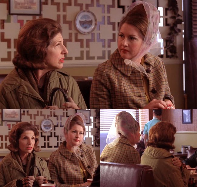 We just LOVED these costumes. They nailed it. You can look at old pictures of the period, pictures of working class women going about their day shopping and running errands, and they all looked just like this. They got every detail down, from the hair to the coats, to the makeup.You know what’s interesting here? Both of these women are sporting hairdos identical to ones Betty sported just a year or two before. Which indicates two things: One, the way styles filtered downscale back then (as opposed to today, when everything from African-American street style to cowboy boots has gone upscale), and Two, the fact that Betty was sporting styles that were about to go out of style.
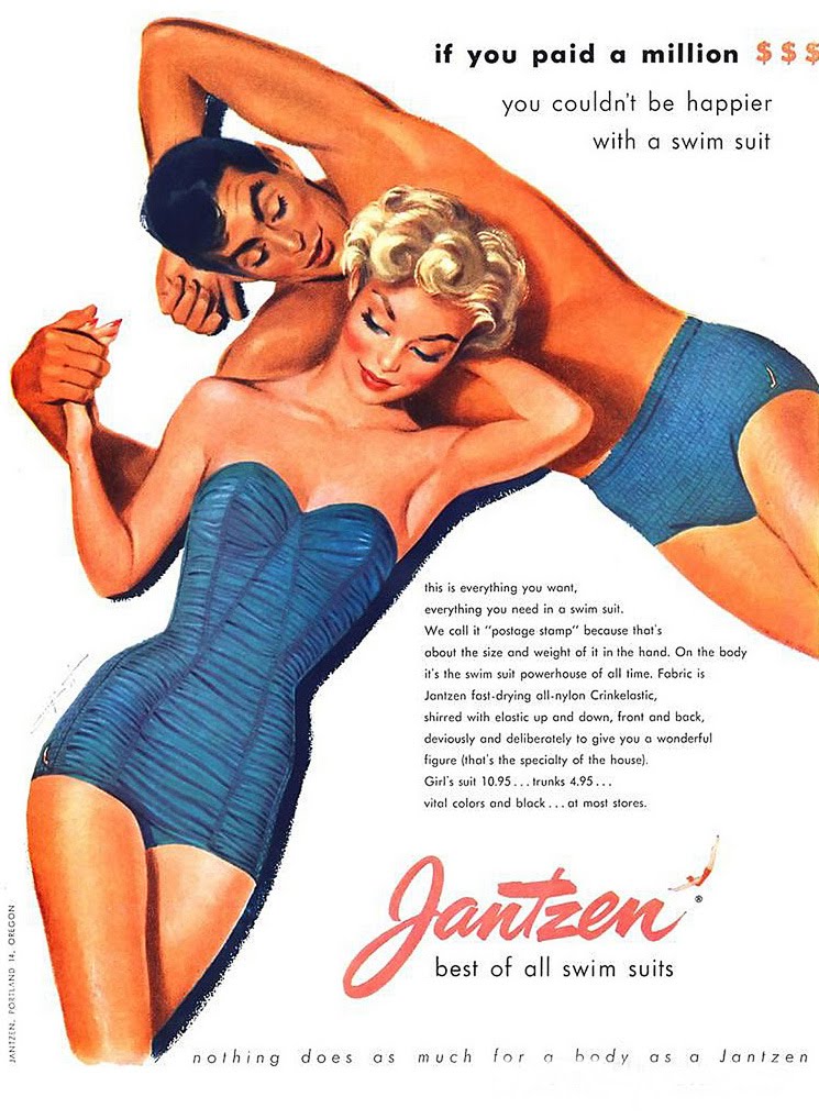
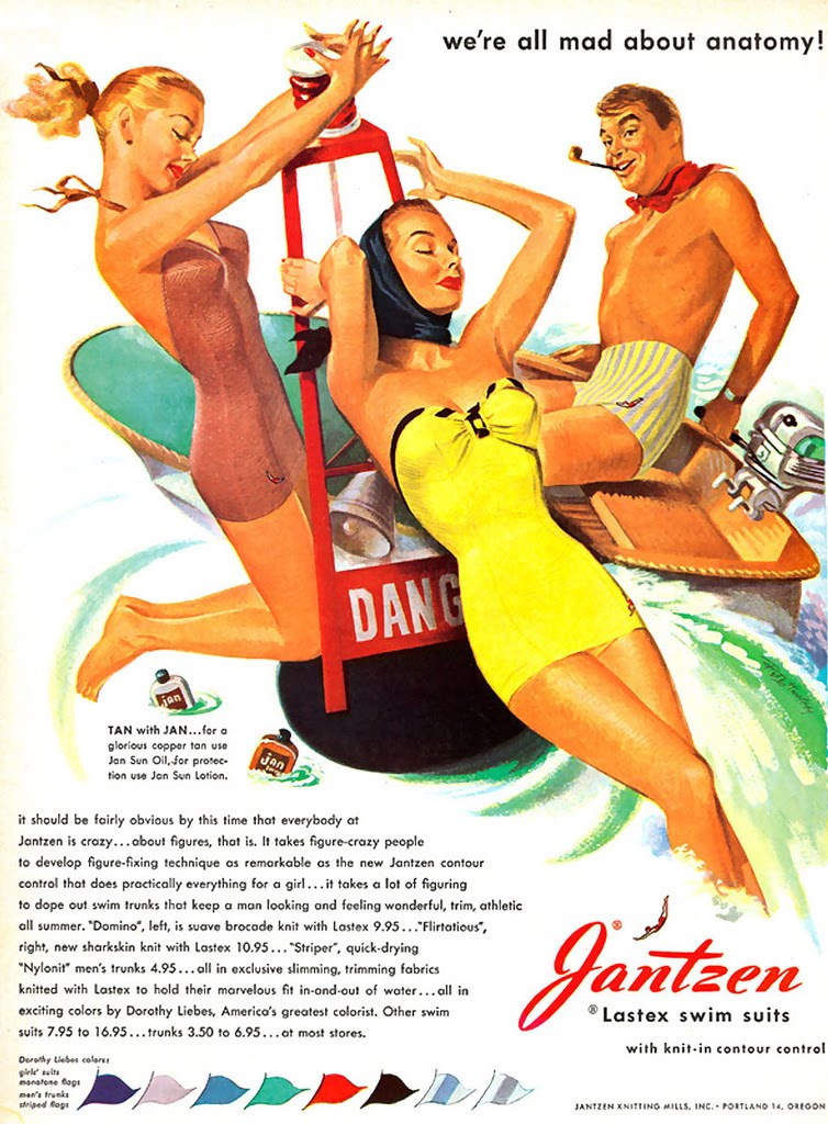
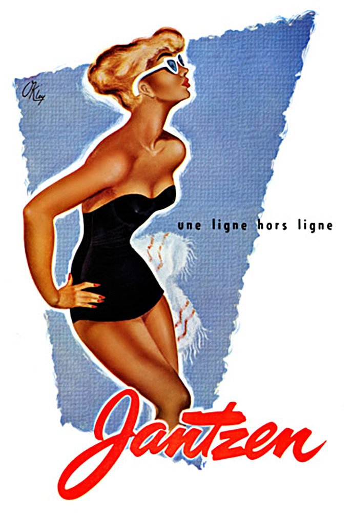
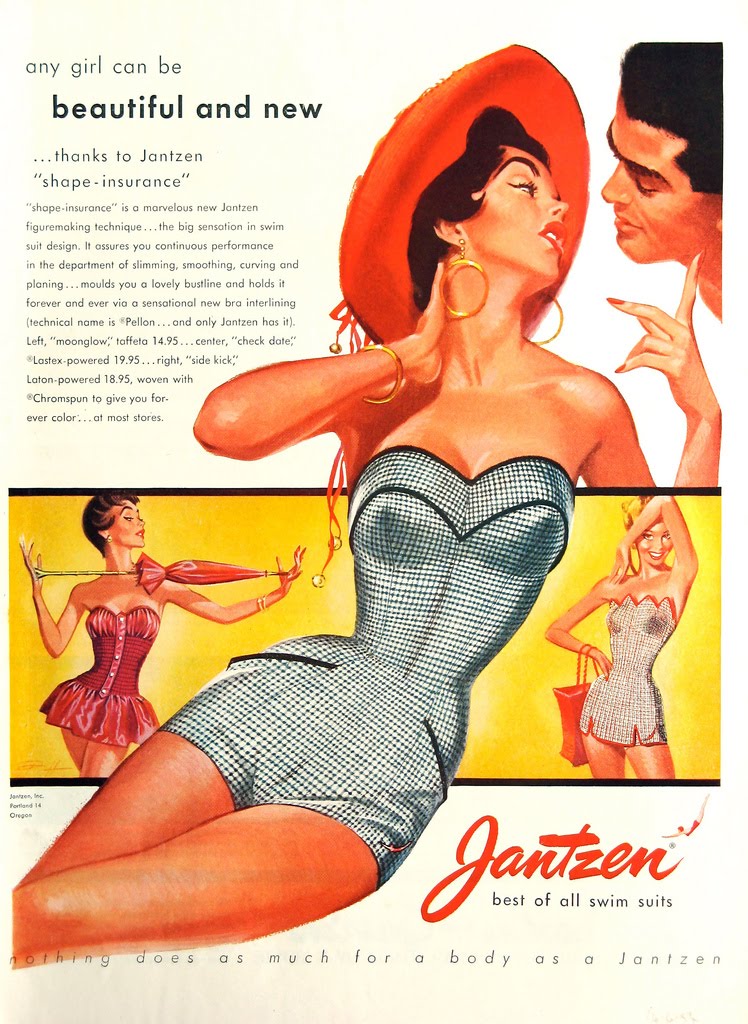
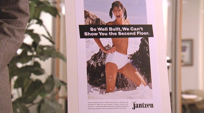 And finally, here’s a shot of the Jantzen ad, which is very much in keeping with the period, when advertising got a little saucier and the industry shifted away from illustration to photography. It’s also of a piece with a common advertising trope of the period, the infantilized sexual woman.Just to end the post with a little more eye candy, here’s some late ’50s ads for Jantzen, just to show you how new and modern the above ad would have looked to them.


[Screencaps: tomandlorenzo.com – Image Credit: amctv.com/originals/madmen/populuxe]
Previous post:
Mad Men Season 4 Episode 1: Public Relations Next Post:
Mad Style: Kitty Romano (Sarah Drew)
Mad Men Season 4 Episode 1: Public Relations Next Post:
Mad Style: Kitty Romano (Sarah Drew)
-

RUPAUL’S DRAG RACE ALL STARS: ATHLETIC SUPPORTER DESIGN CHALLENGE
-
The Bitter Kitten Movie Club: BABETTE’S FEAST (1987)
-
Pop Style Opinionfest: Courtside Celebrities and Crazy Fandoms
Please review our Community Guidelines before posting a comment. Thank you!